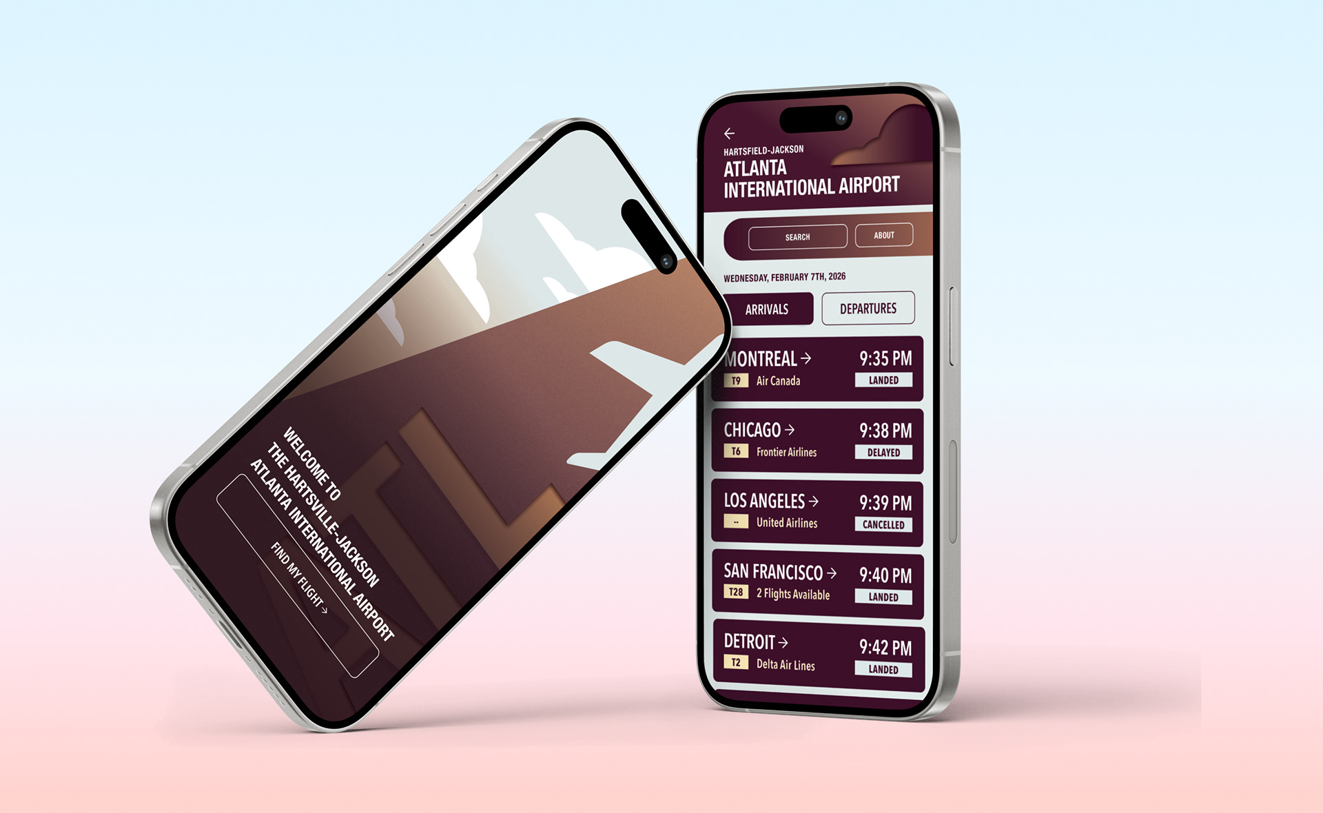
HARTSVILLE-JACKSON AIRPORT APP
Typography 2 | Objective: Demonstrate abilities to develop a visual/typographic system that would be implemented in an information system for a phone and transportation terminal.Visually and typographically communicate complex content: tabular hierarchy, data, imagery, and symbols.
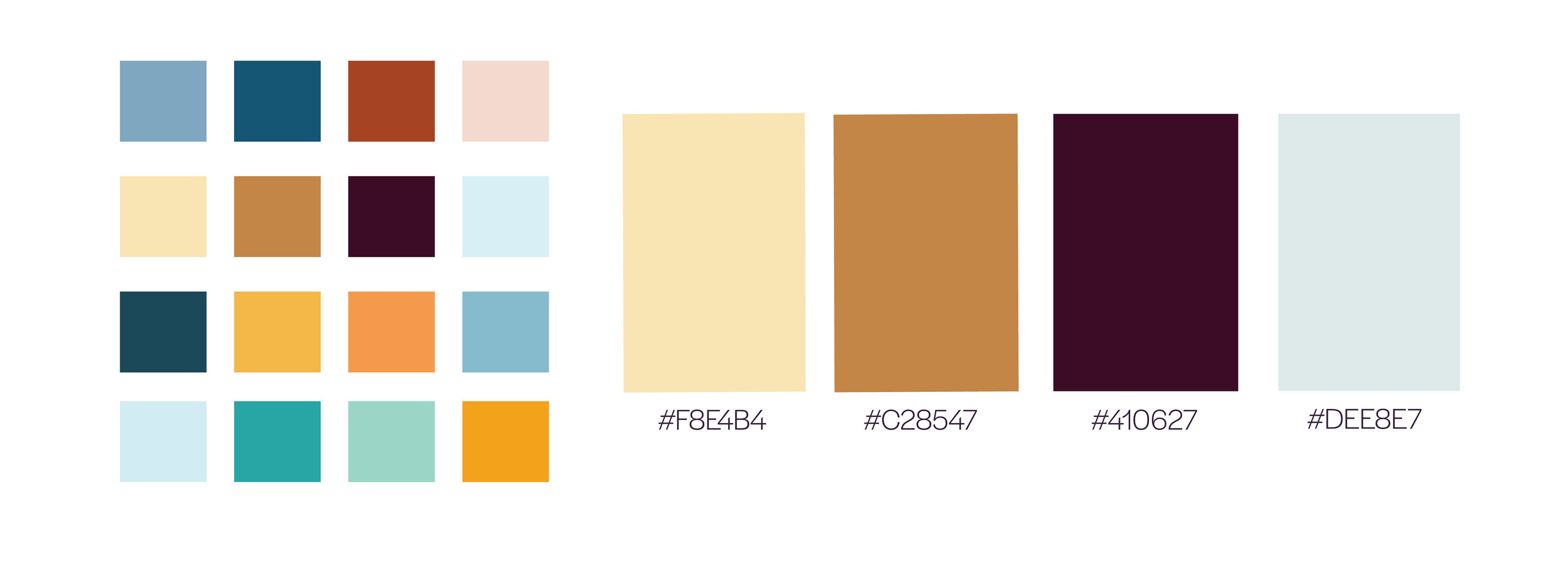
COLOR PALETTE EXPLORATION
For this project we were instructed to explore different color palettes first. I decided to explore palettes that reflected the themes of a southern airport. Due to the climate of the southern states, I wanted a palette of warm tones while also incorporating a hint of blue, leading me to choose the second palette for my project.
CELL CONCEPTS AND ITERATIONS
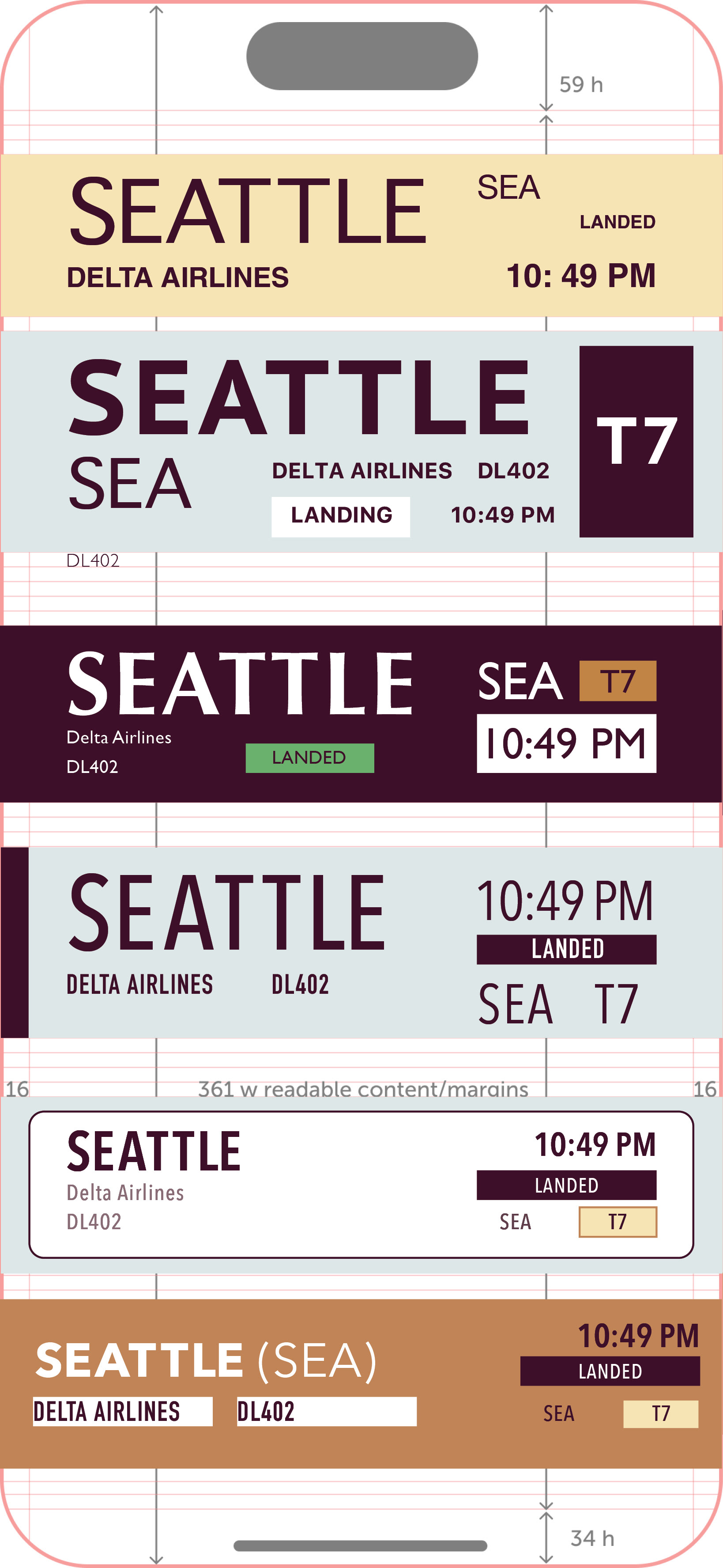
Next I developed a variety of different cell concepts for my airport app, prioritizing as many different forms of hierarchy, color, and layout as I could.
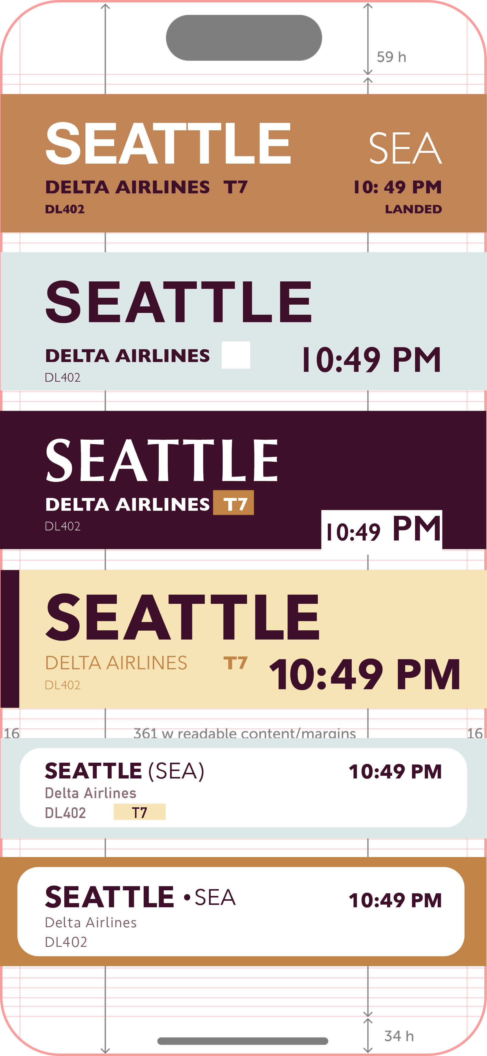
PHONE SCREEN ITERATIONS
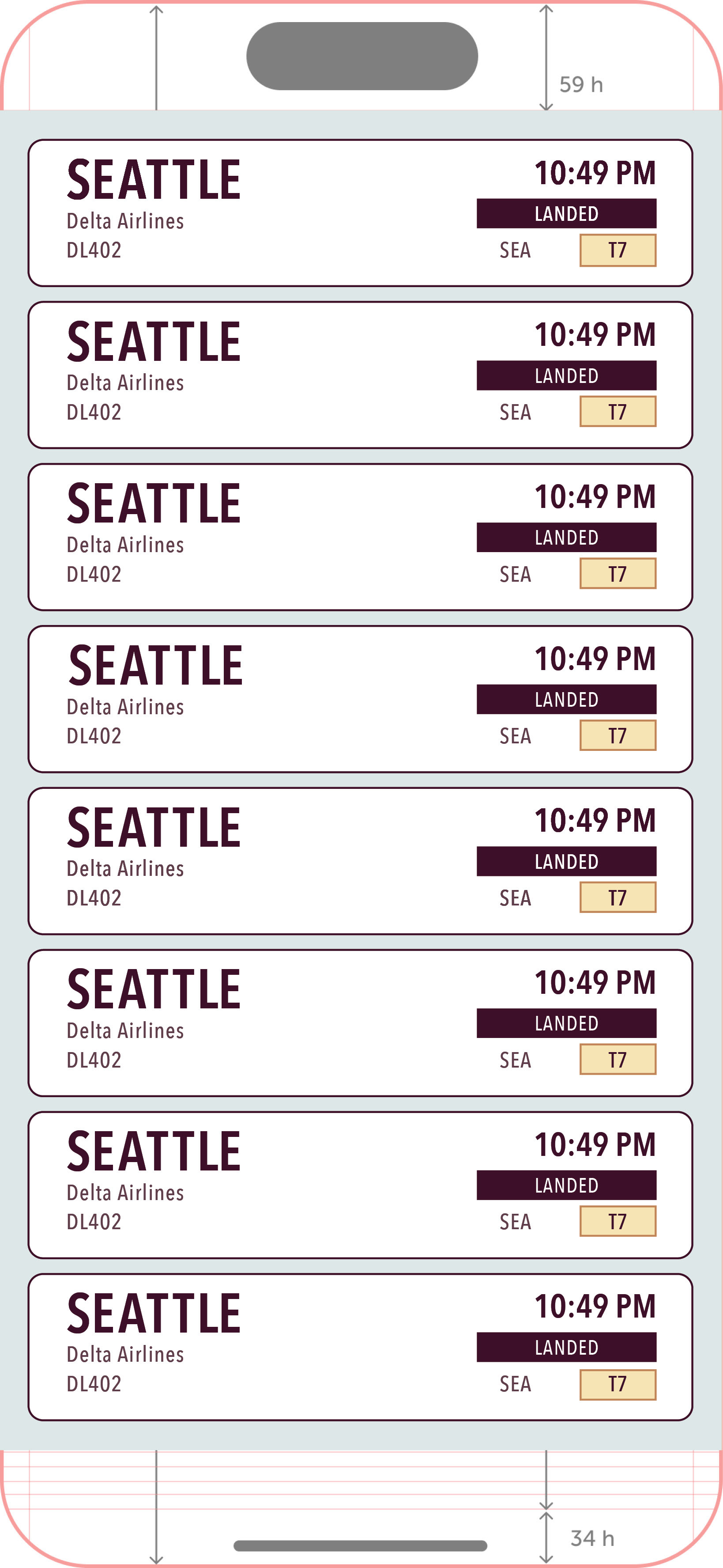
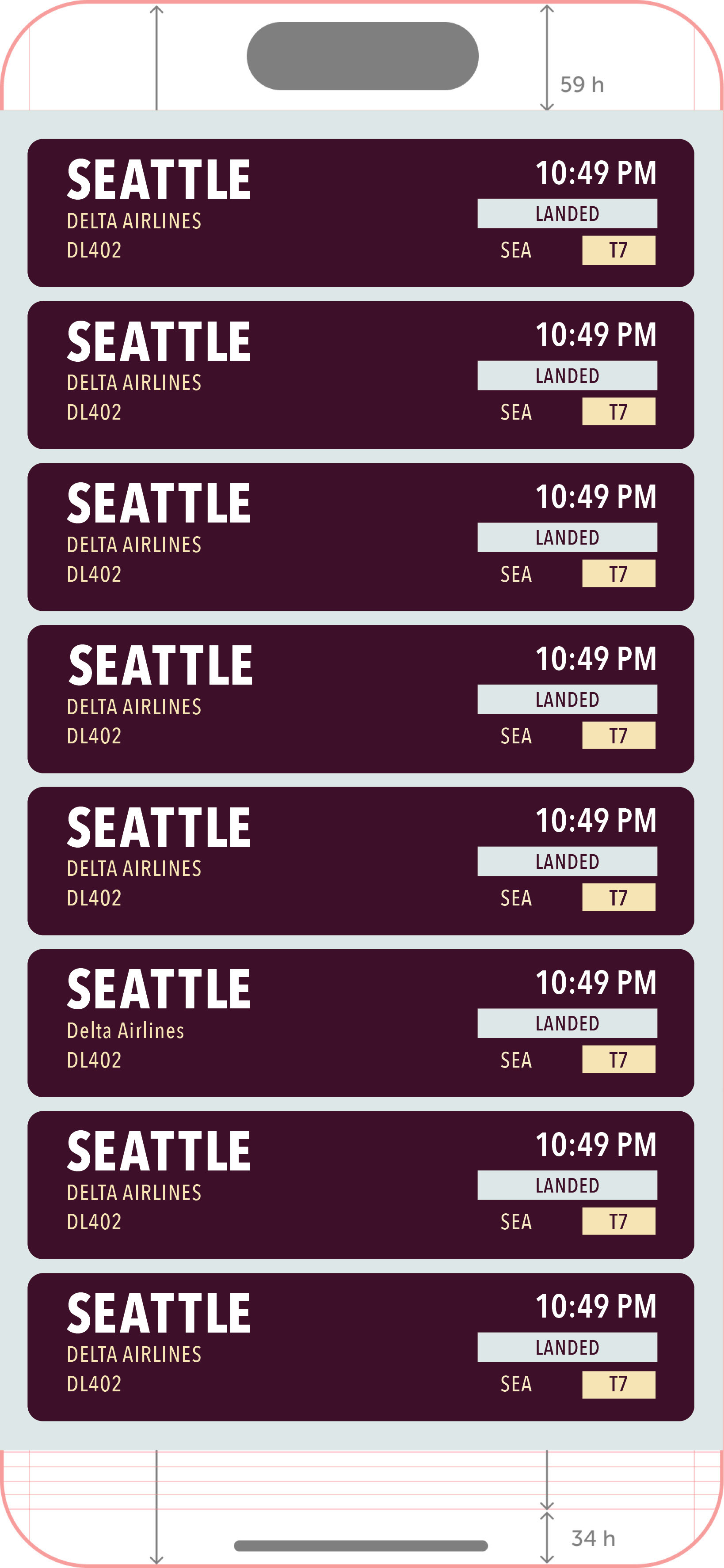
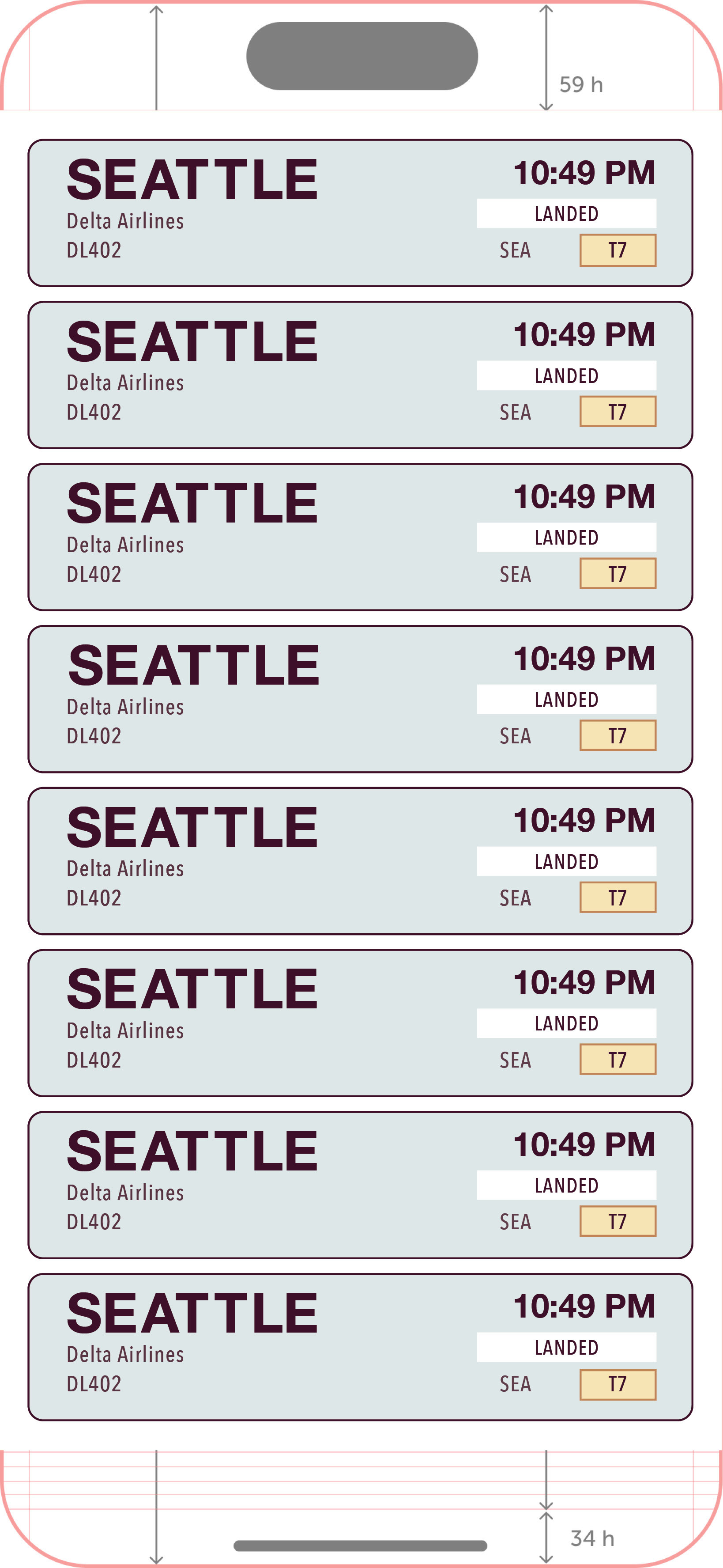
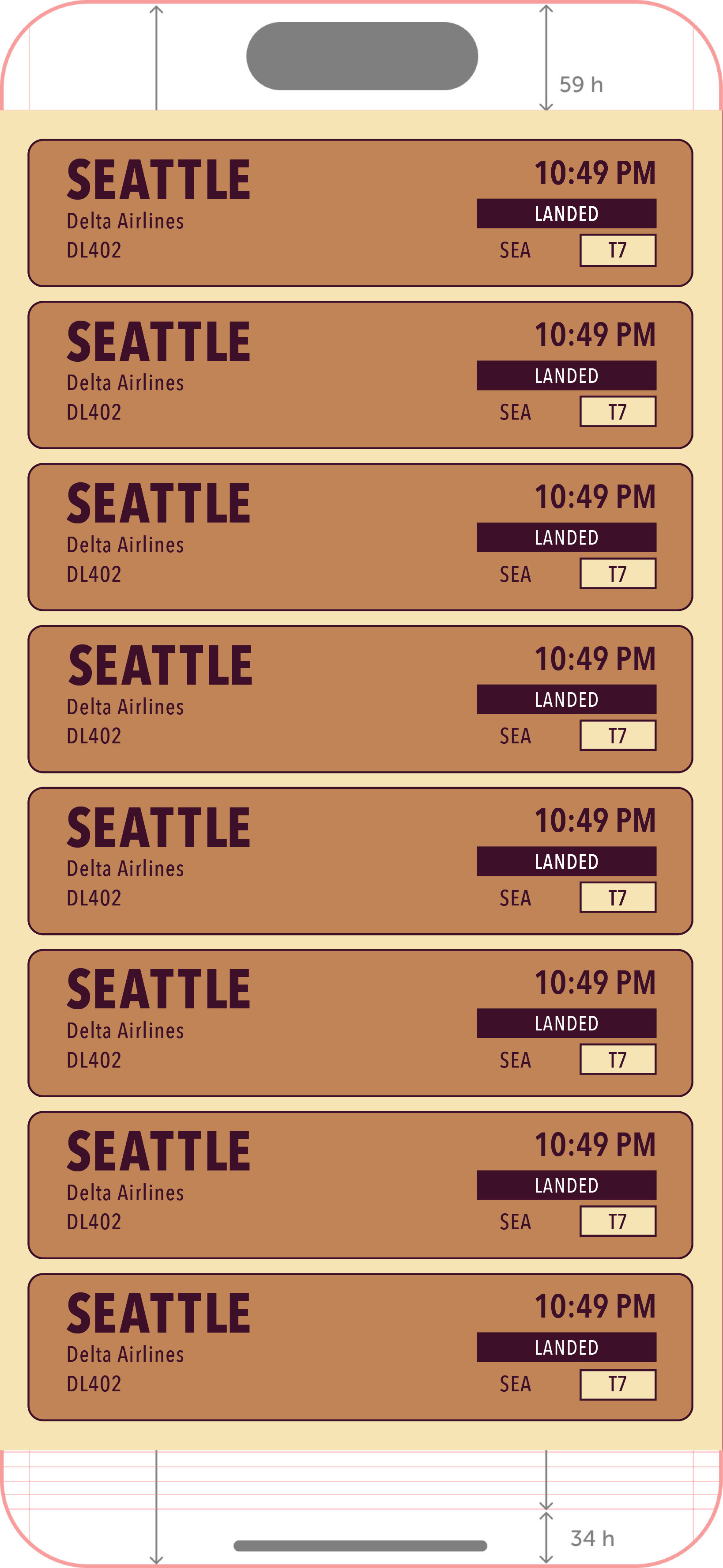
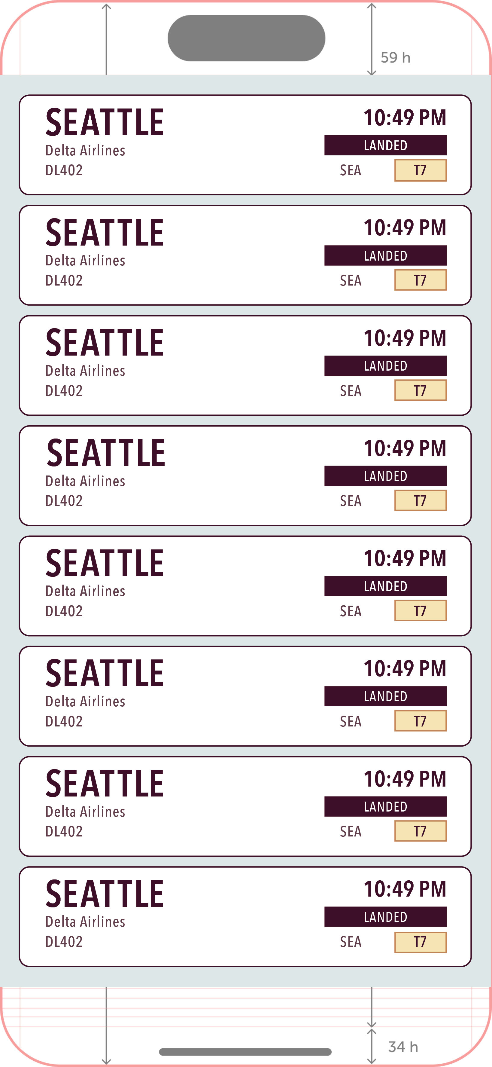
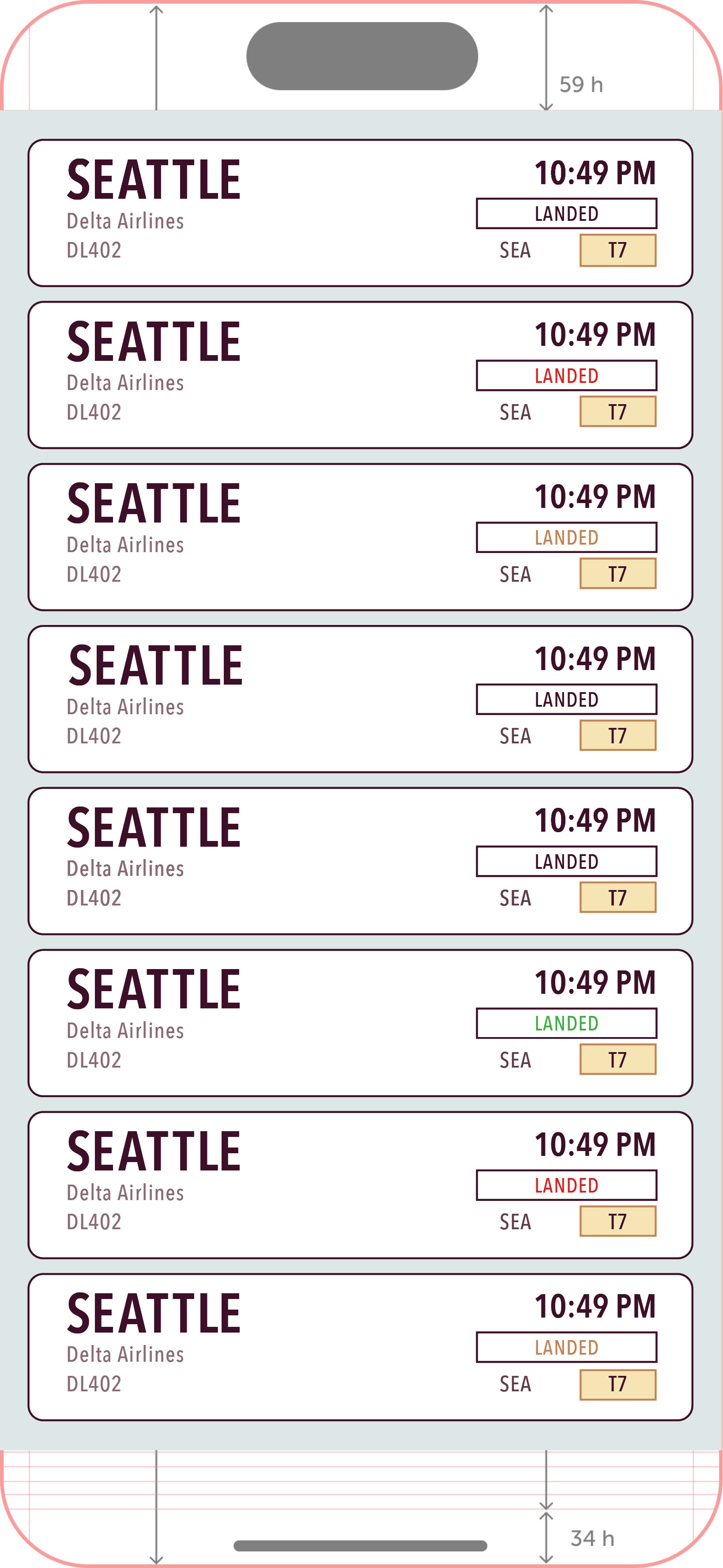
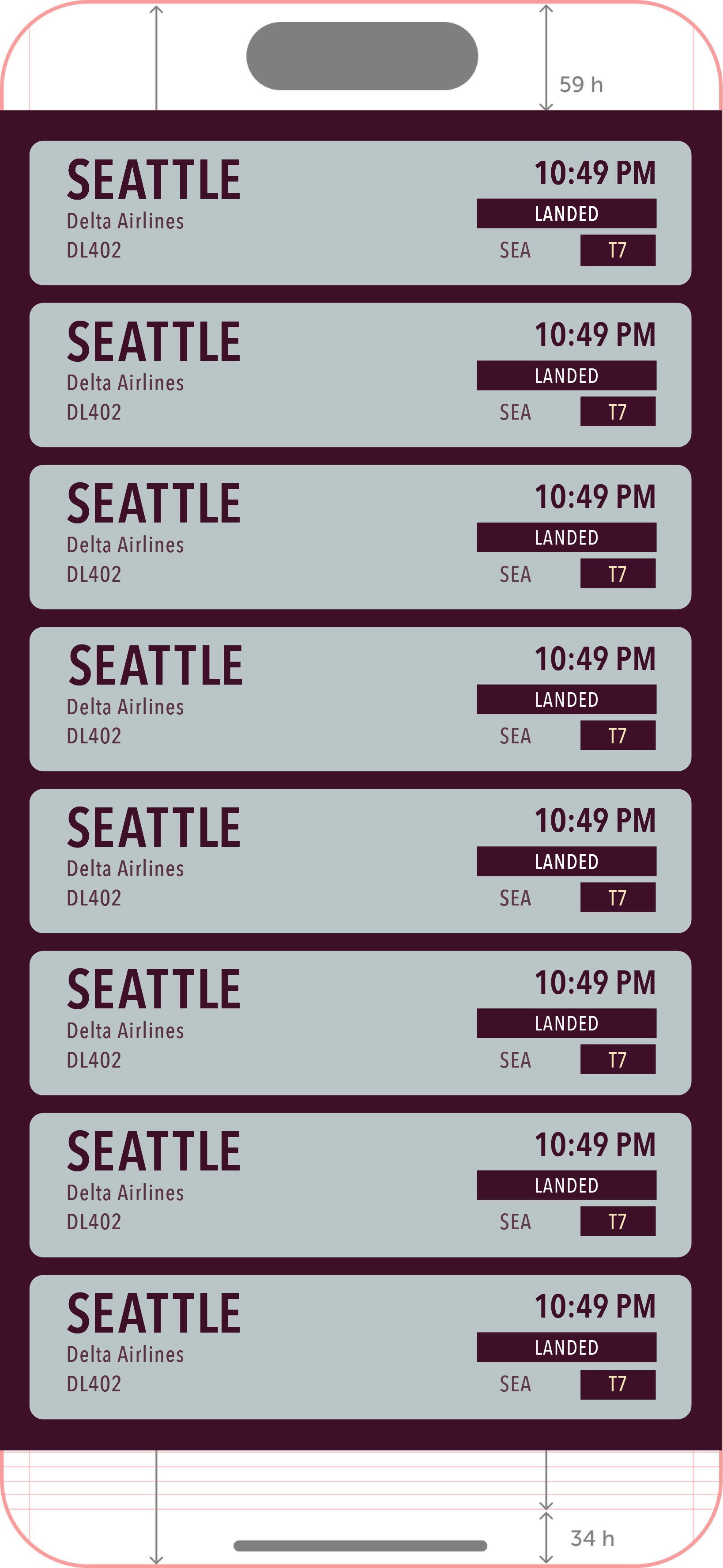
Once I selected my final cell concept, I created eight different iterations to test how they would look laid out all together on a phone screen.
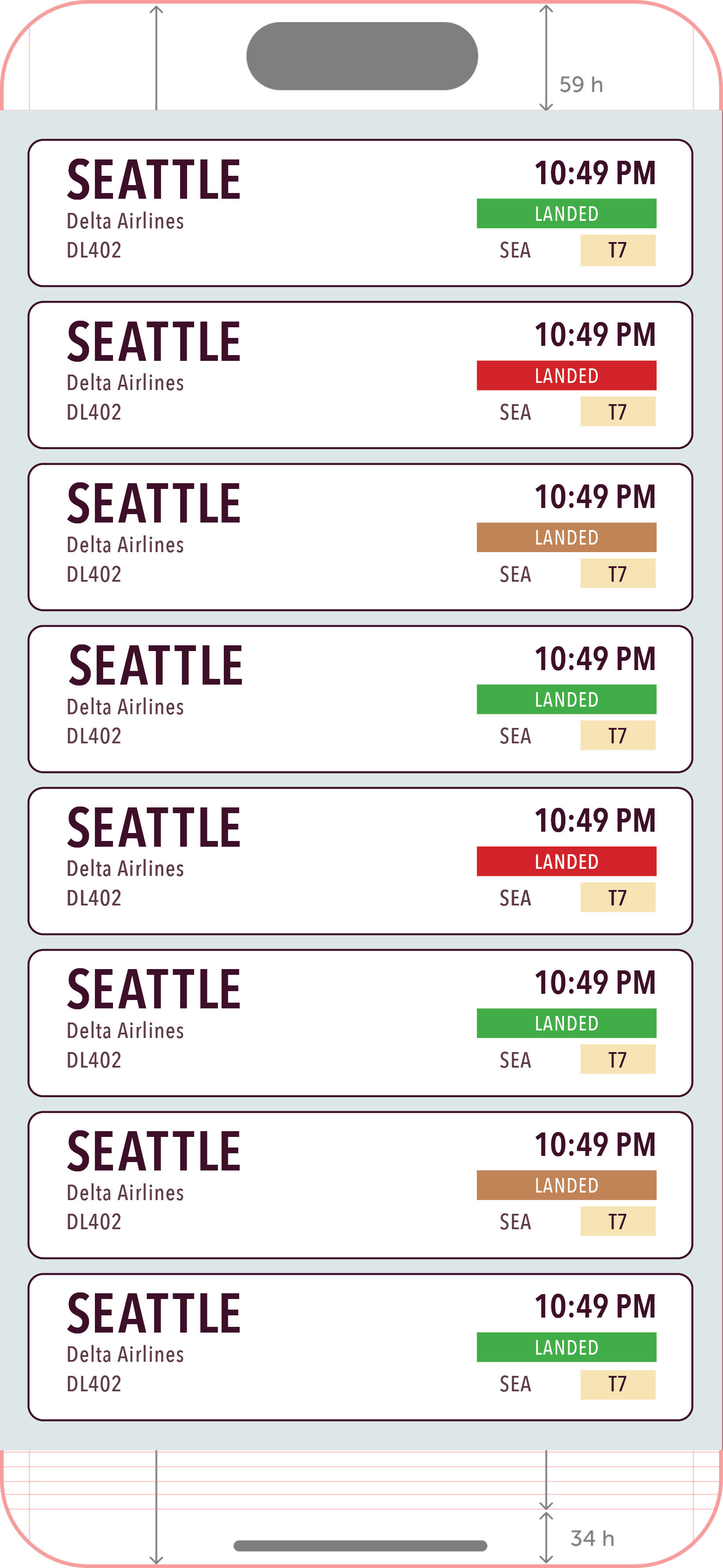
FIRST DRAFT
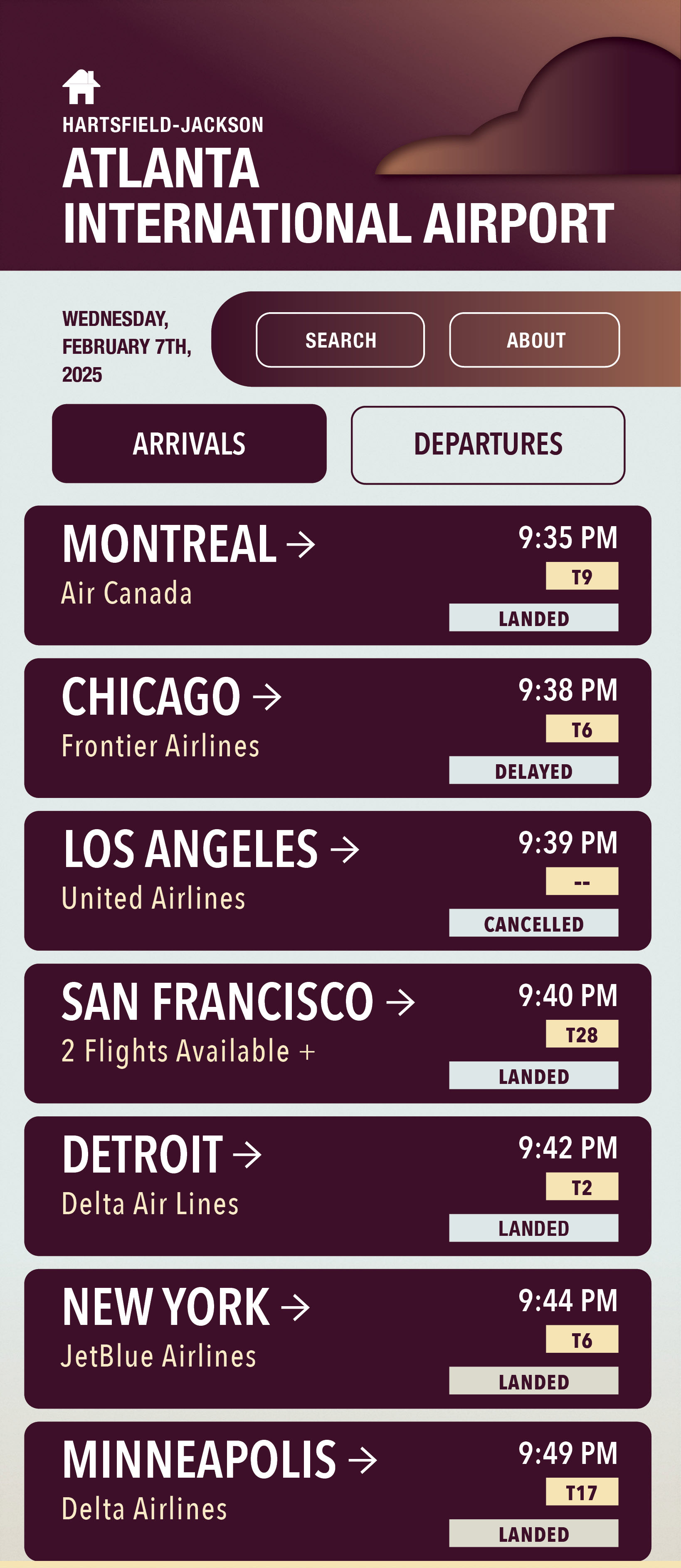
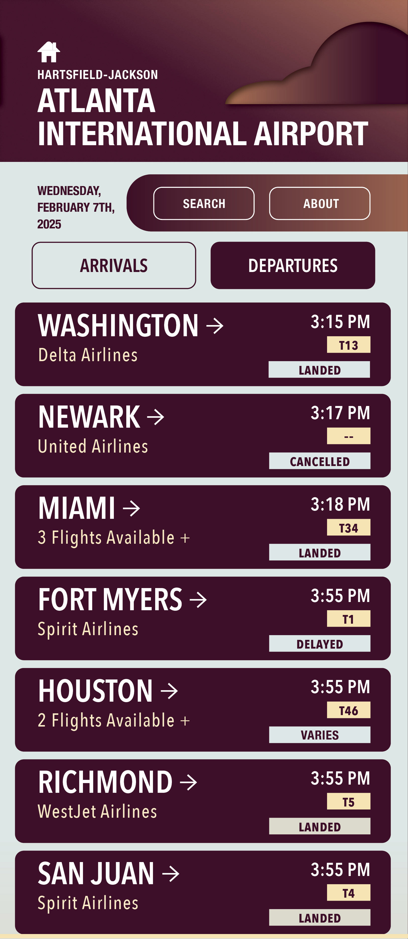
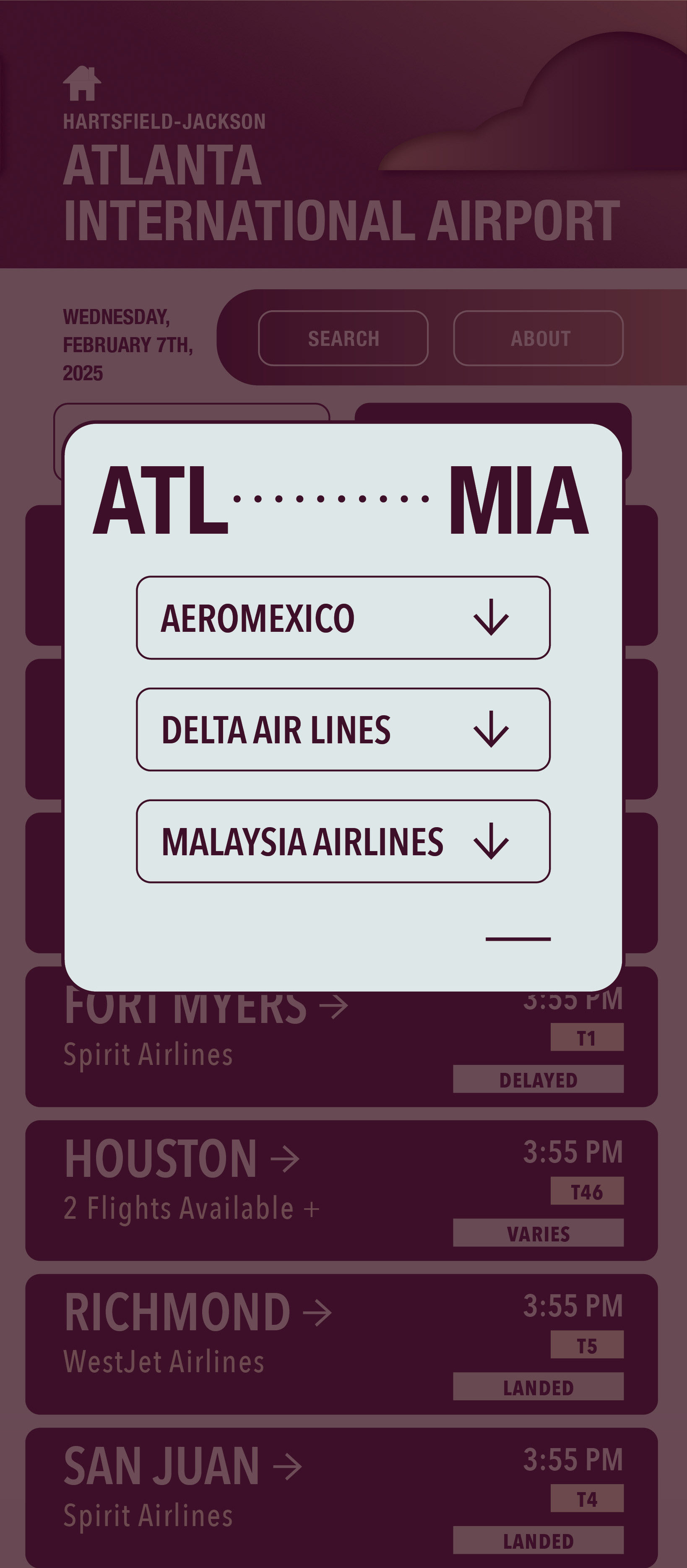
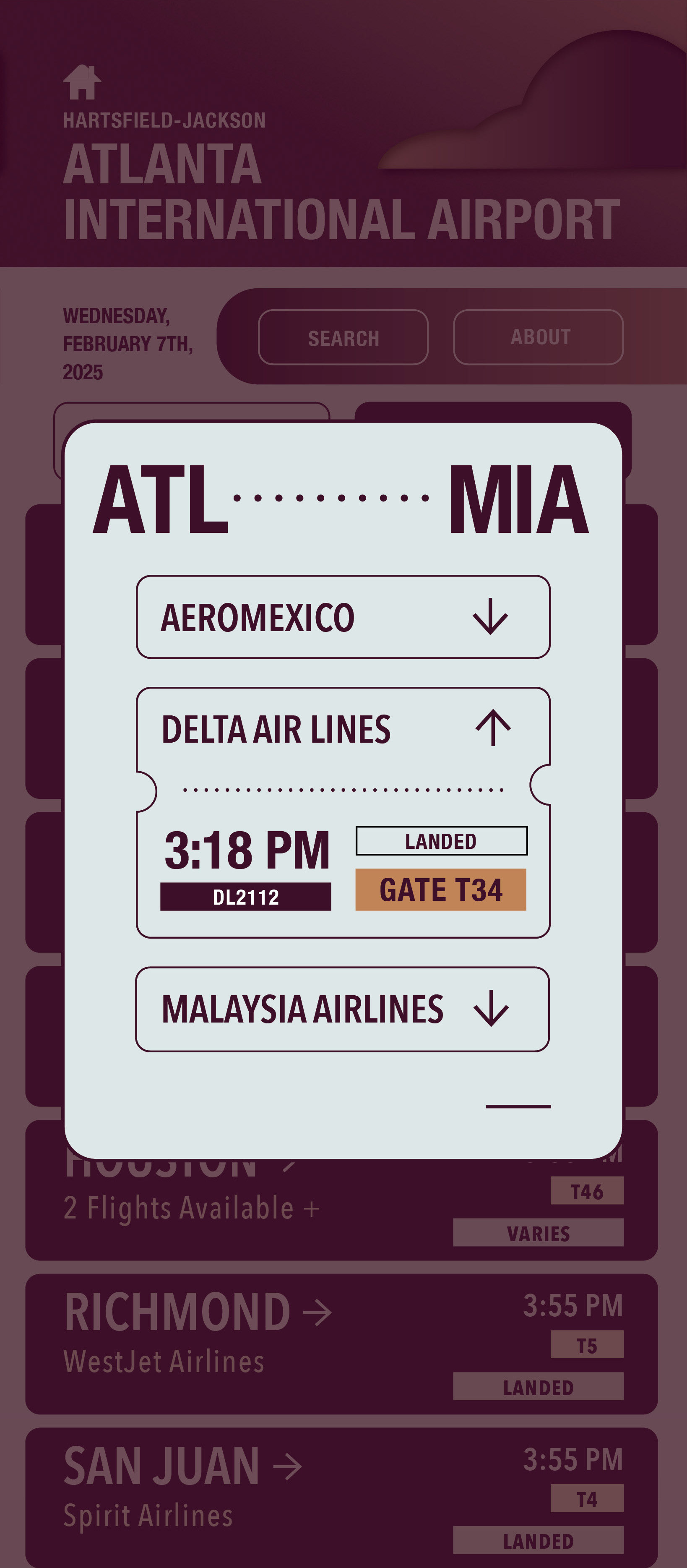
I built out all of my app screens using Indesign and then transferred them into Figma.
PROBLEM SOLVING
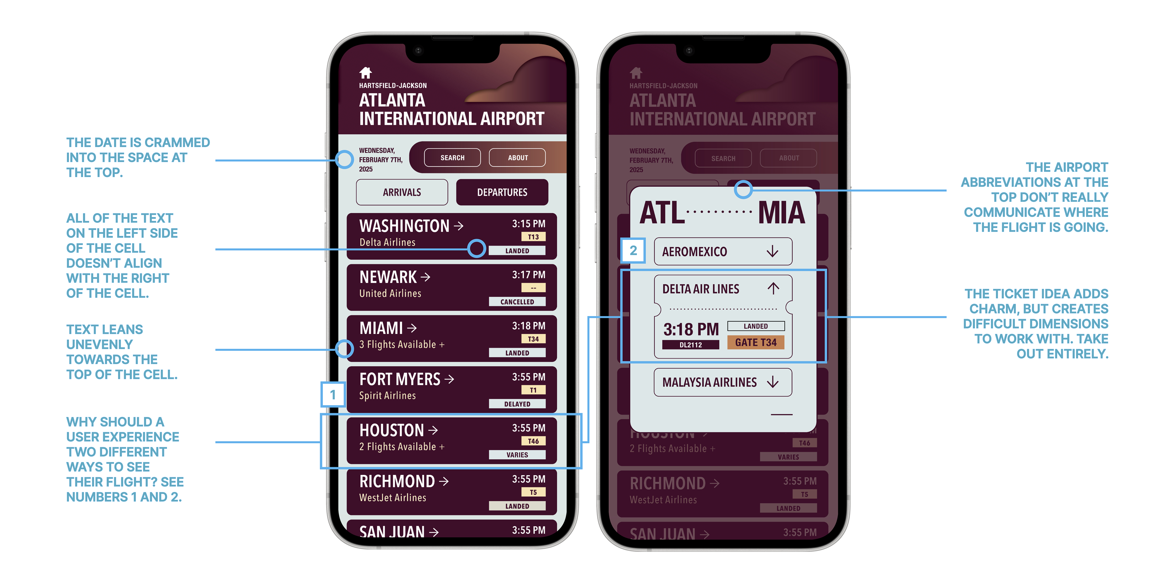
While the above images are what I submitted for my final project, over the summer I decided to redesign my app in order to make it better.
GRIDS AND GUIDES
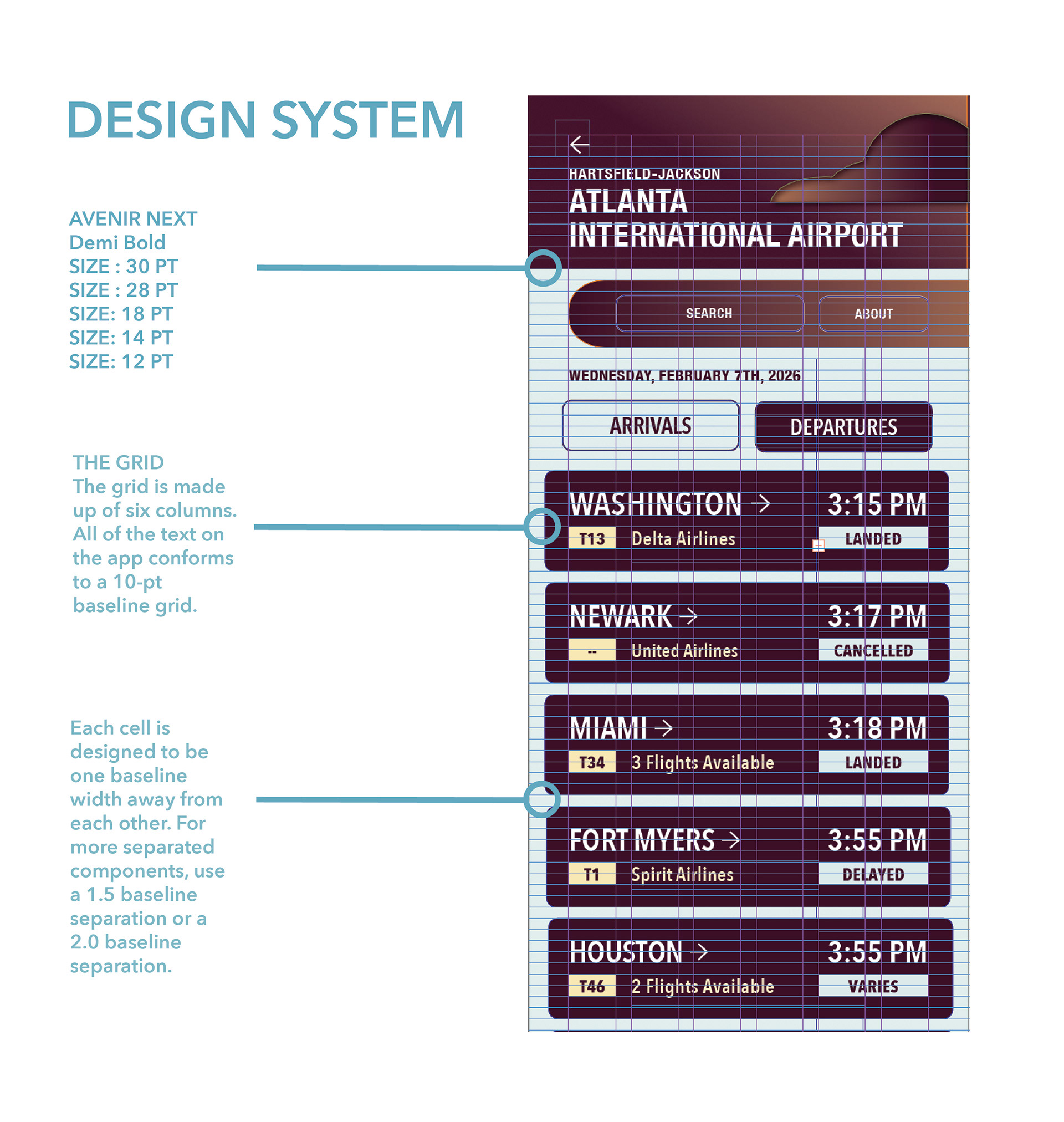
The image on the left is just a glance at some of the guidelines used to make the airport app. I used a 10pt baseline grid with six columns as the primary guidelines for the interface. The interface is built to suit an iPhone 16 and conforms to the standards.
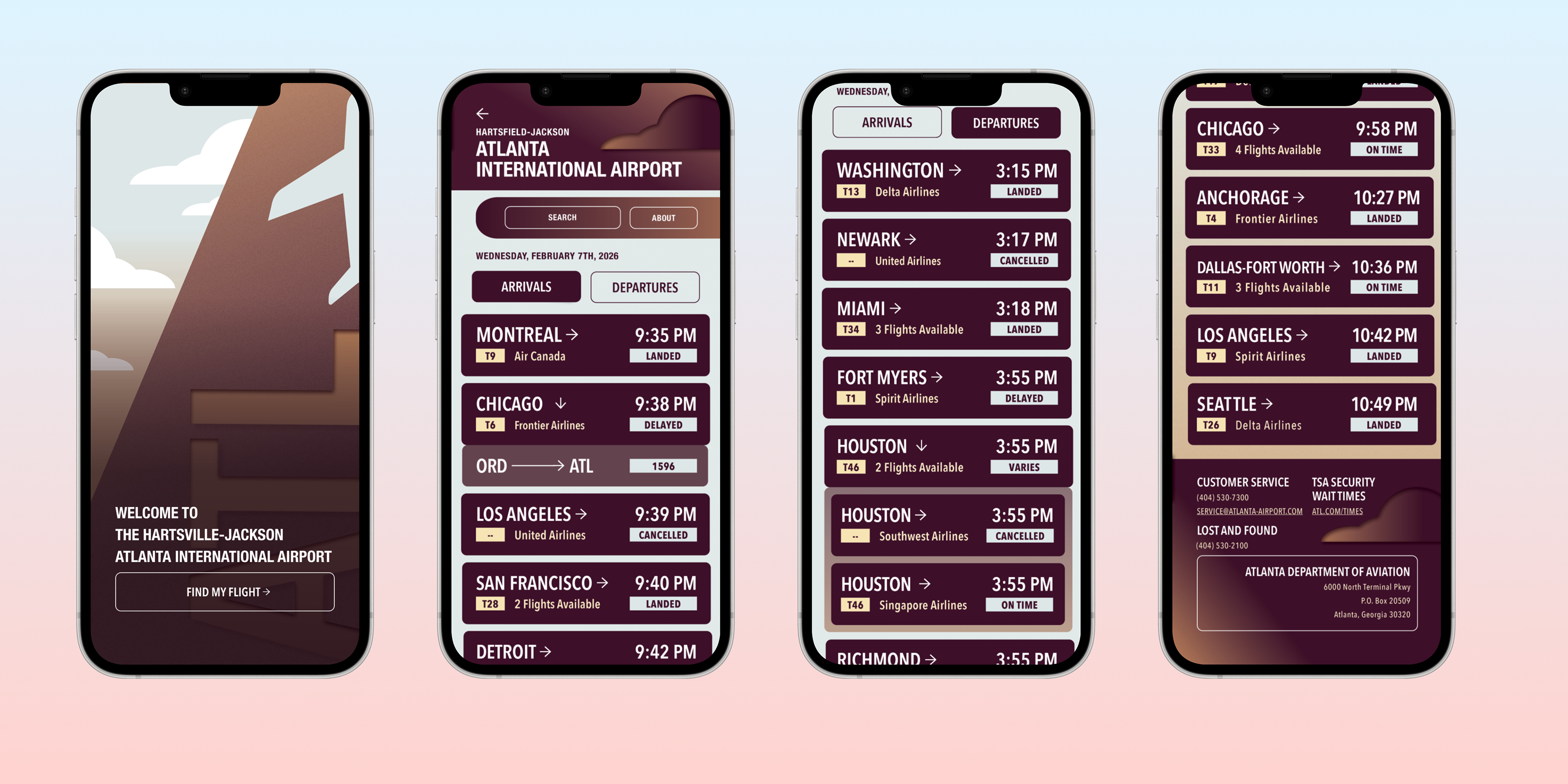
In this image, you can see how I changed aspects of the interface compared to the above image. I did this by making my cells taller so they didn't feel so crammmed. Then I split up the status and gate information so they would balance each other out more (instead of being concentrated on the right).
FINAL APP SCREEN INTERFACE
FINAL VIDEO