ON THE AXIS | FALL 2025
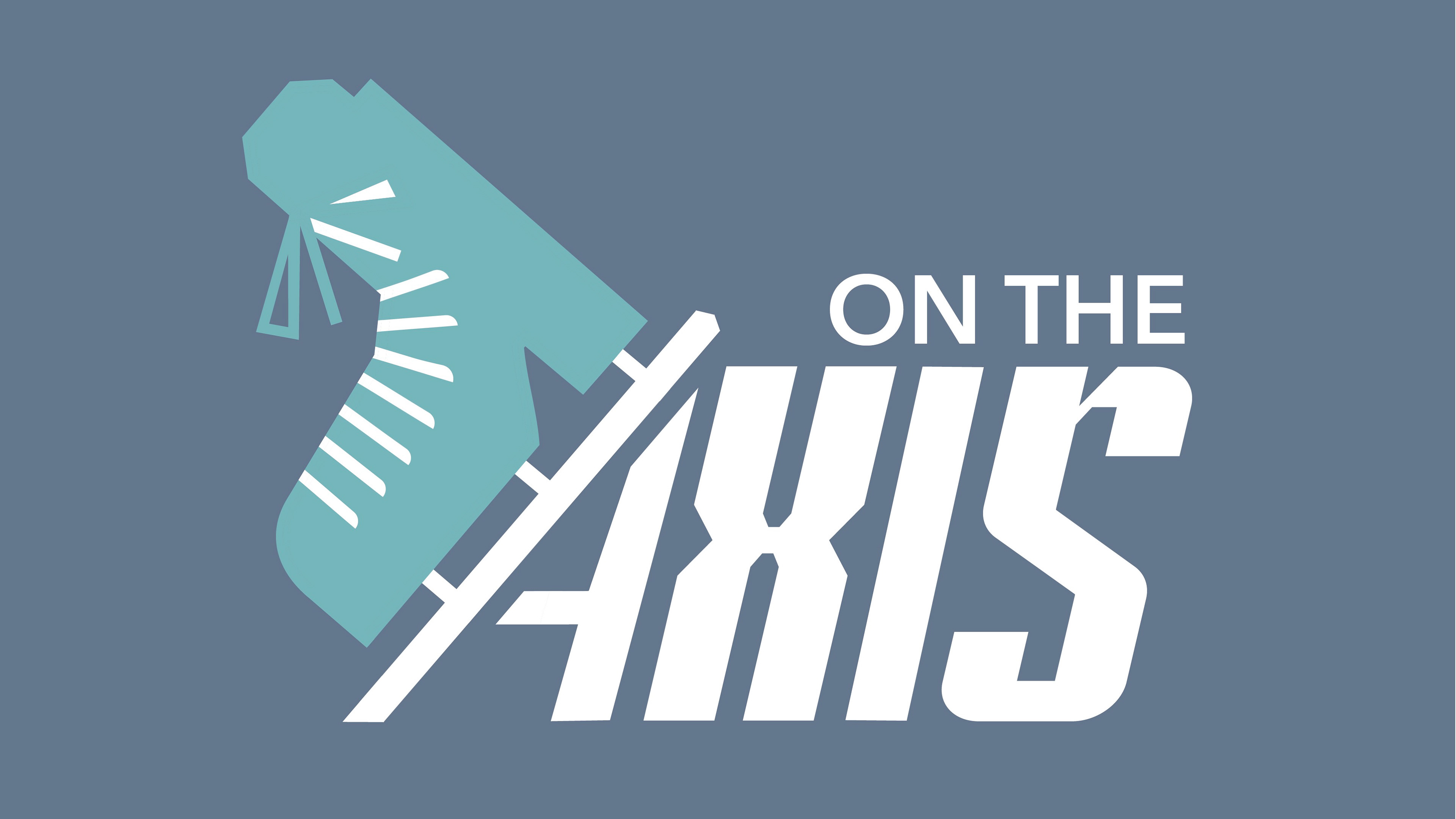
Design Drawing | Objective: Create an iconographic image that utilizes abstraction to represent the category of objects that your item belongs to. Investigate how specific elements, kinetic qualities, or context can be emphasized so that the meaning of the icon can be easily and quickly discerned.
INTIAL SKETCHING
To start the process I decided to create a short series of quick, ten-minute sketches to help narrow down the angles of my ice skate.
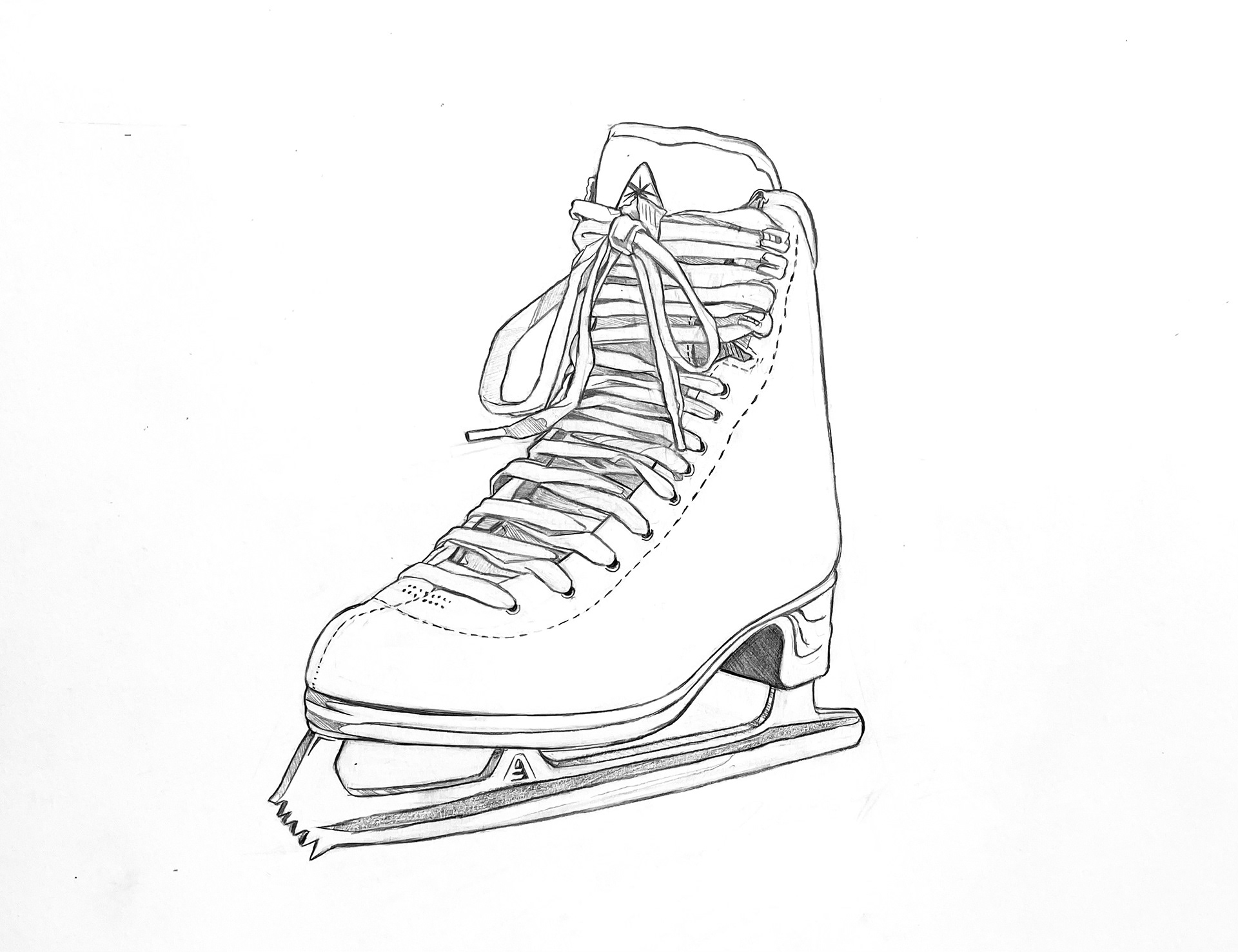
Sketch 1
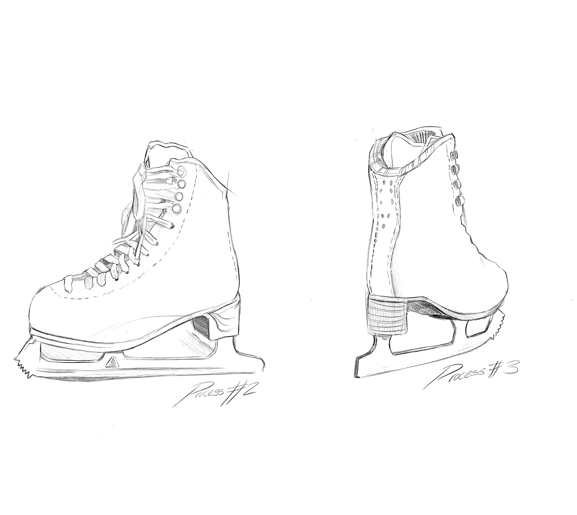
Sketch 2 and 3
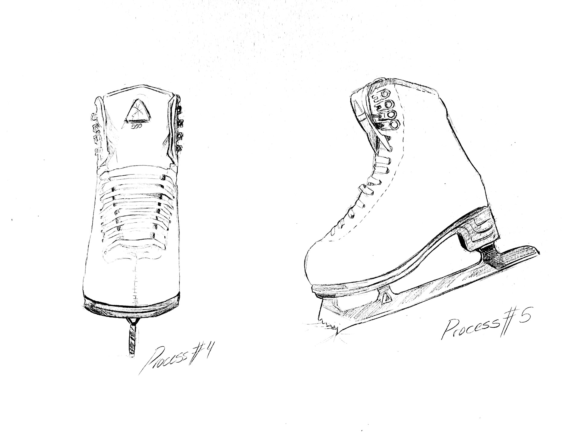
Sketch 4 and 5
ADDITIONAL STUDIES
Below are a series of studies communicating the object (left to right): graphite line translation, digital line translation, graphite rendering, and a graphic rendering utilizing the gestalt principles to communicate form and shape.
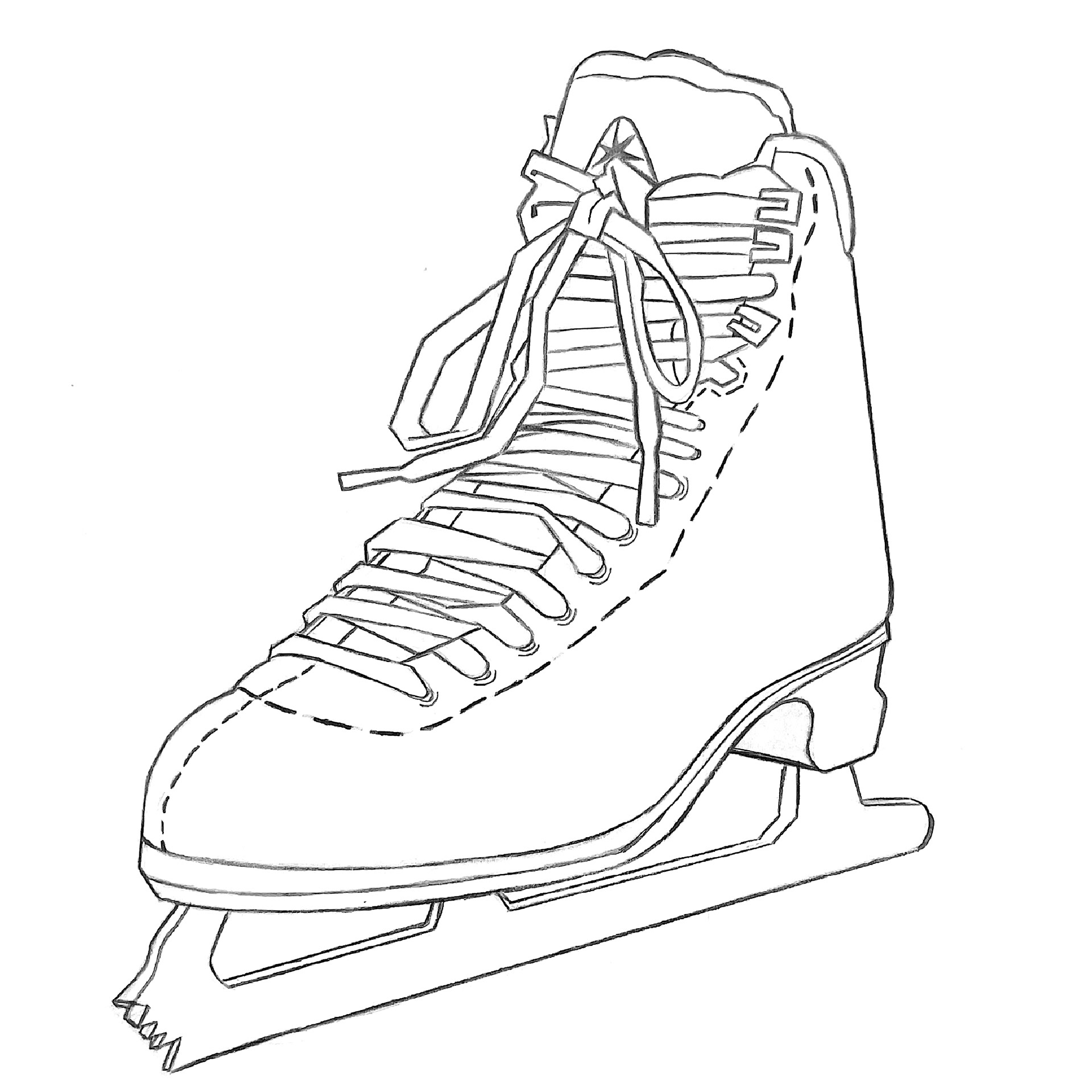
Graphite Line Study
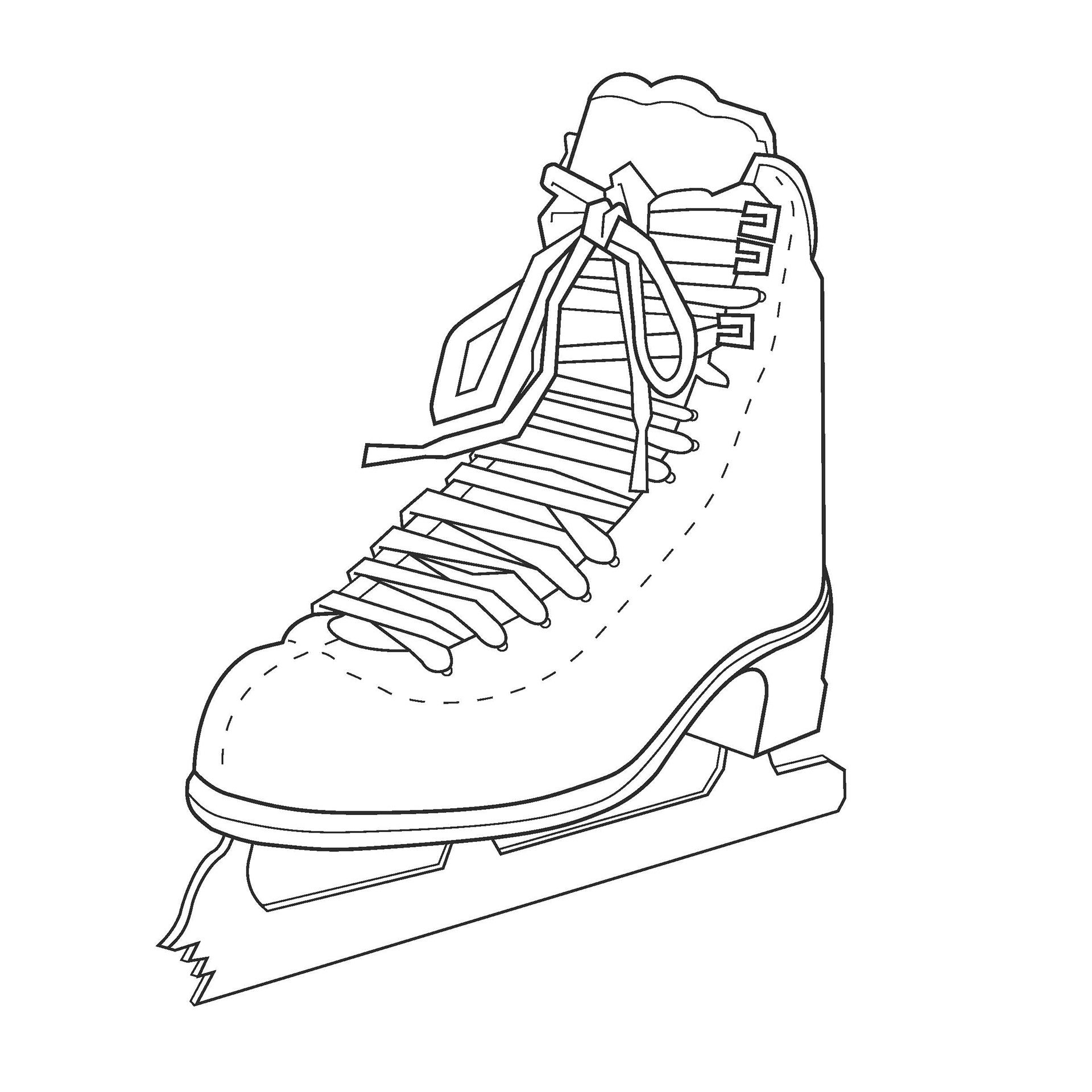
Point and Line Study
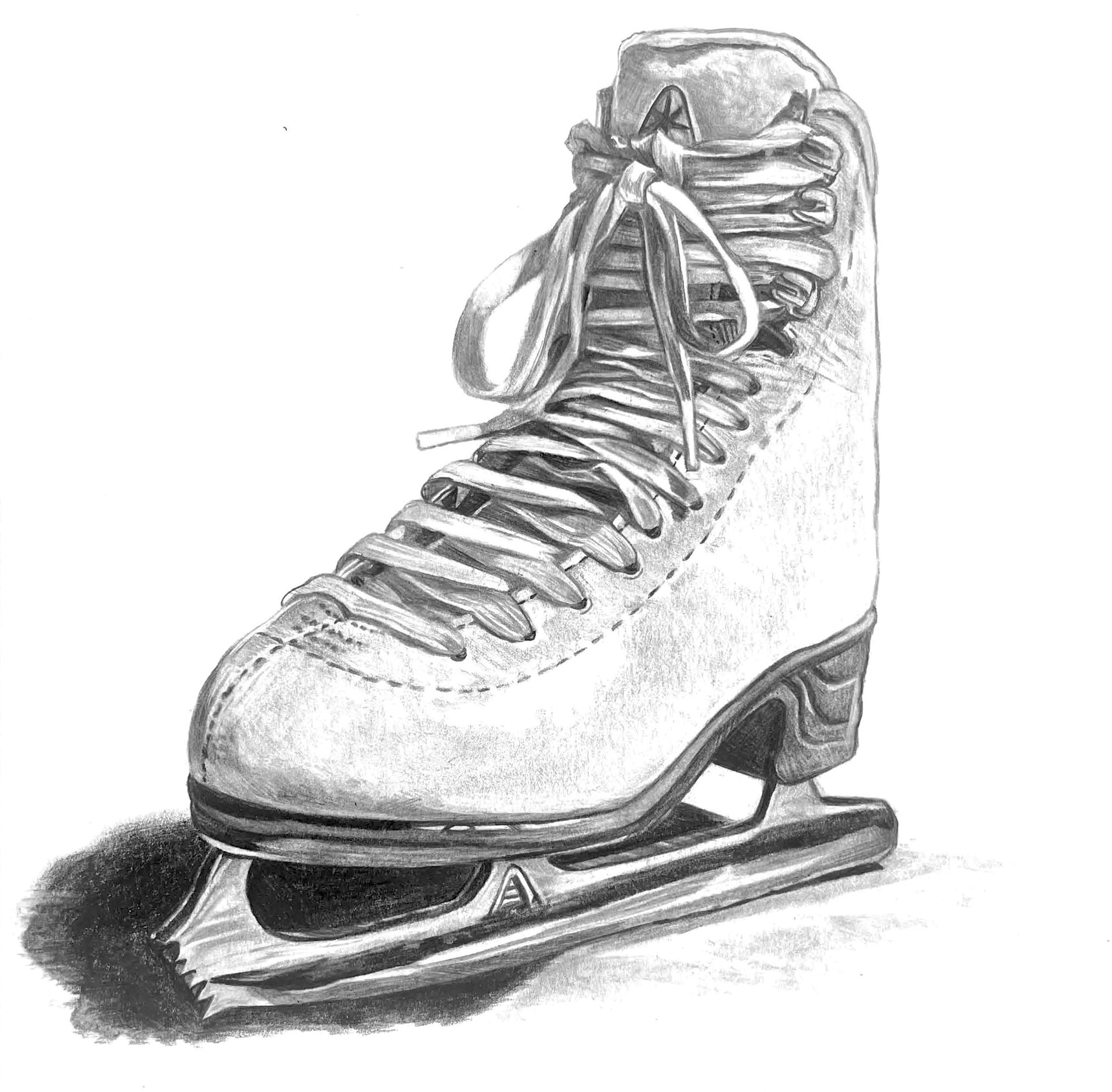
Graphite Translation Study
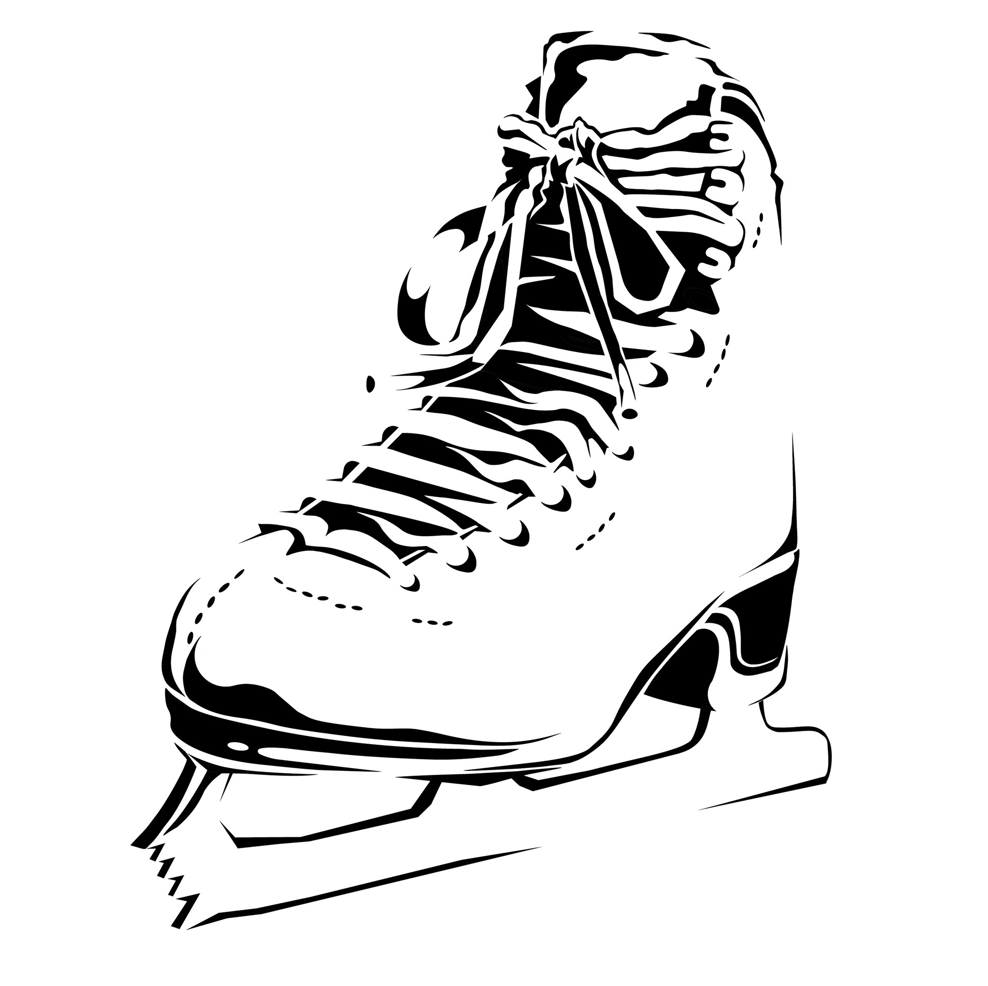
Graphic Translation Study
ICON EXPLORATION
I started the icon exploration for my ice skate by going back to my roots-sketching firsthand on pencil and paper. This helped me break away from the screen and allowed me to have more creativity and variation within my sketches.
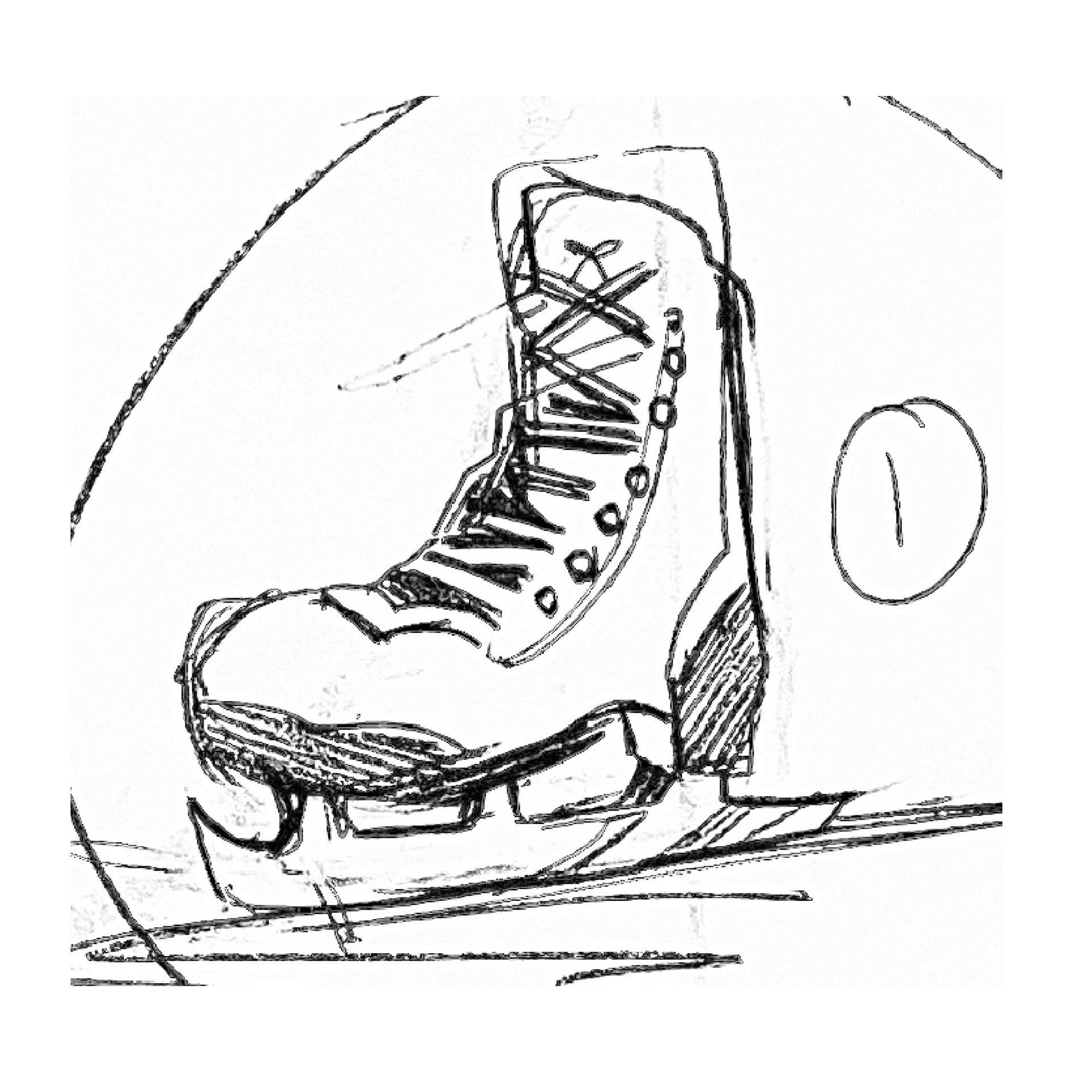
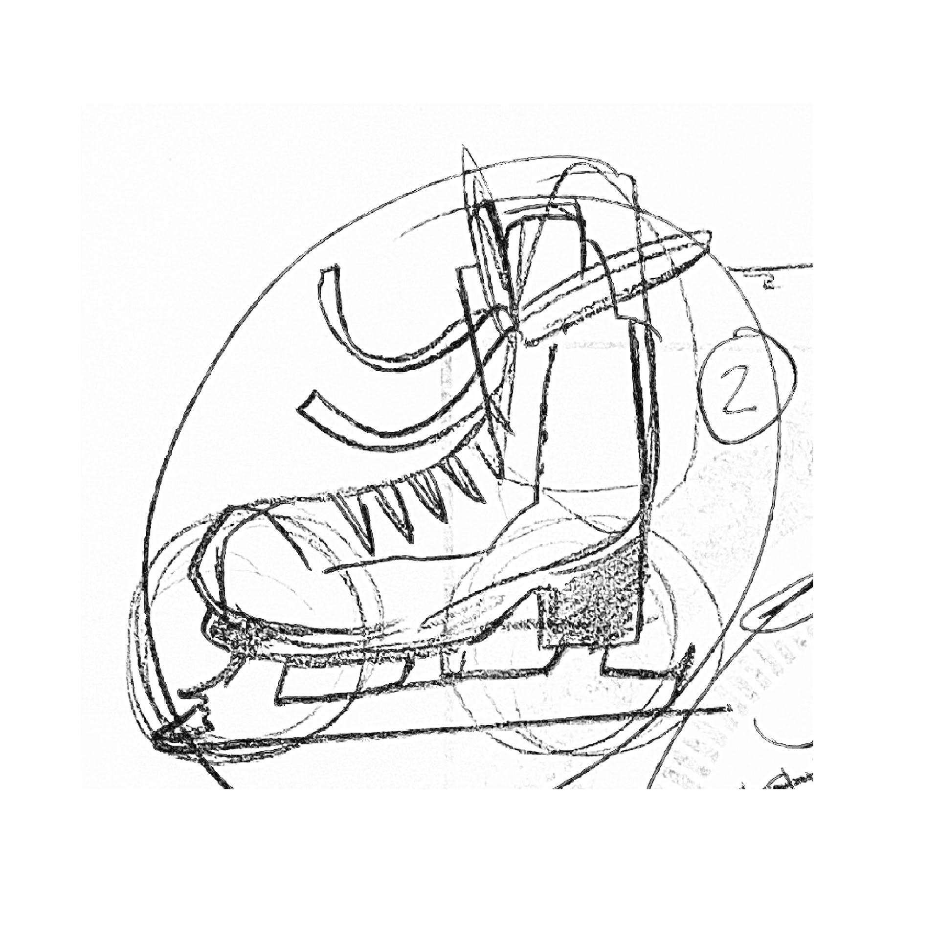
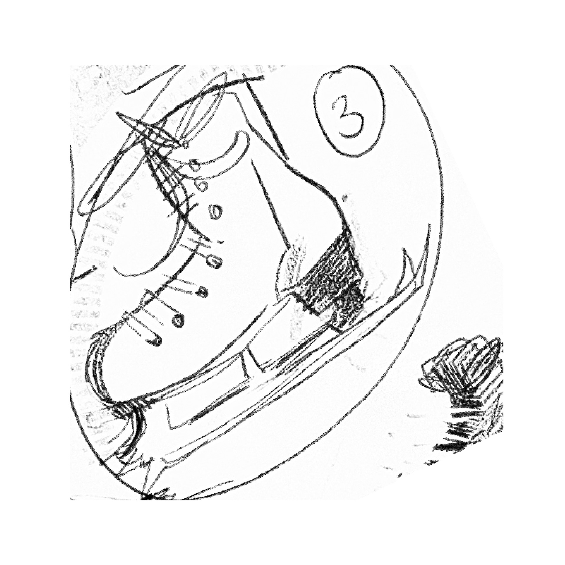
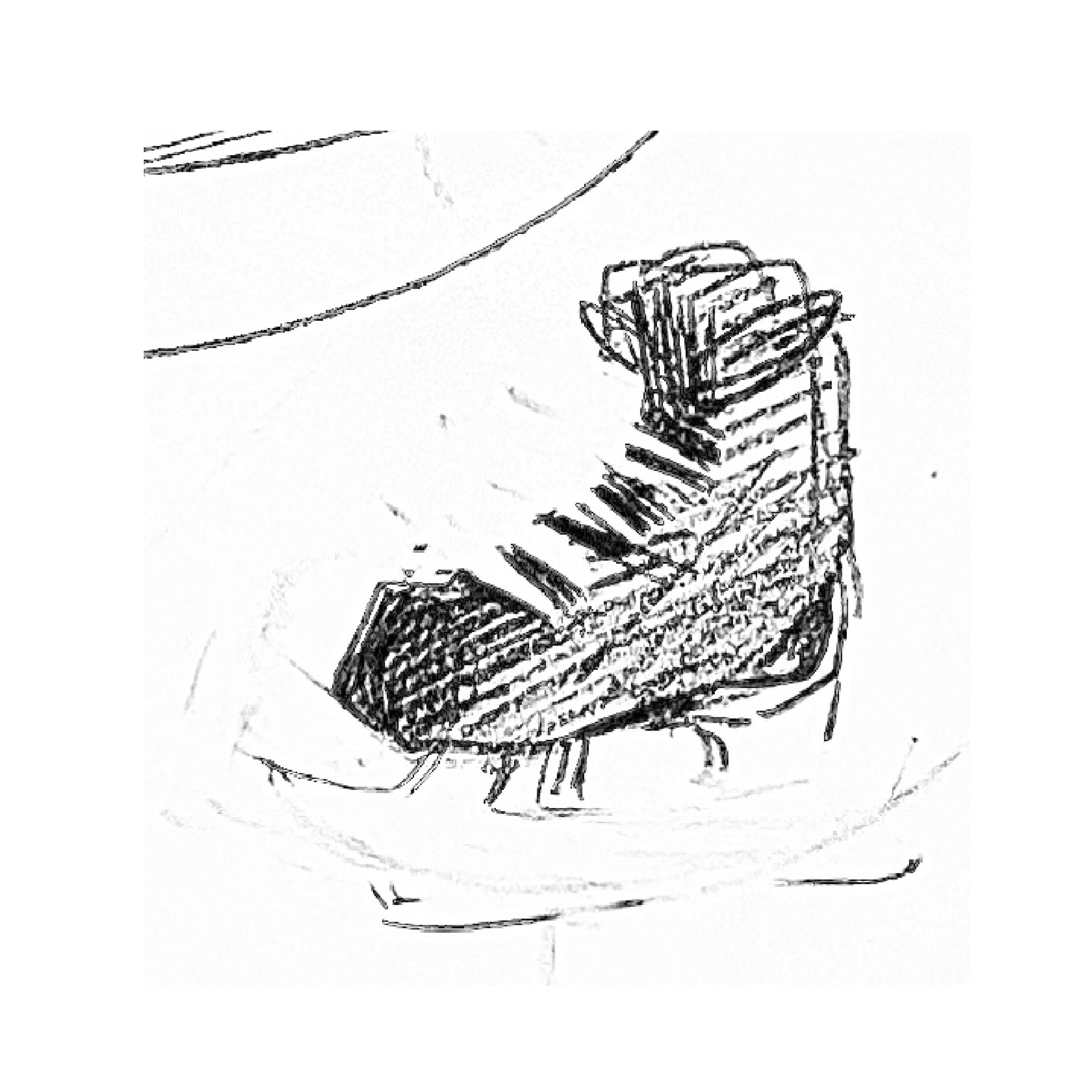
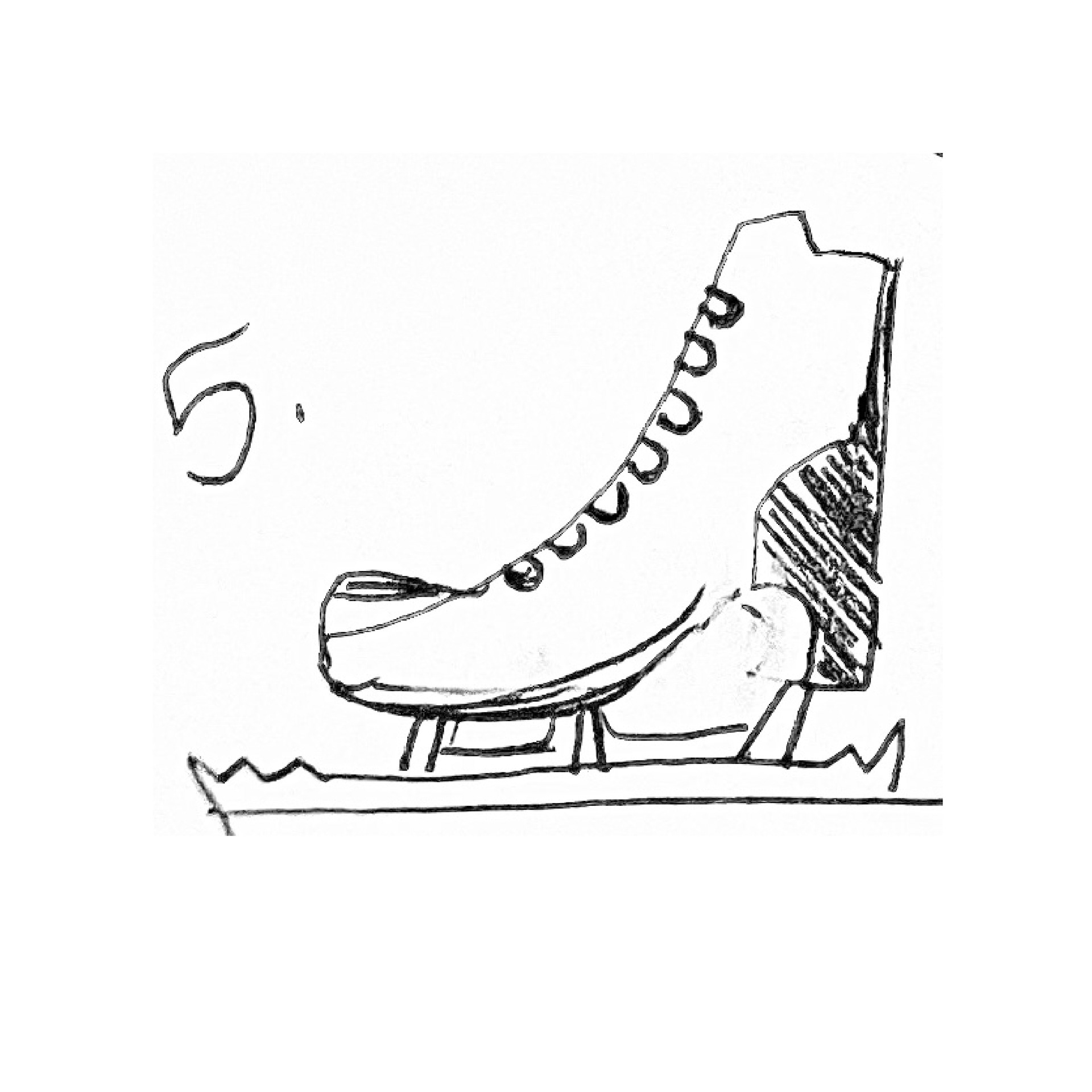
DIGITAL VARIATIONS
Next, I took my physical sketches and iterated on them digitally. This left me with a range of concepts to choose from as I worked towards the final logo.
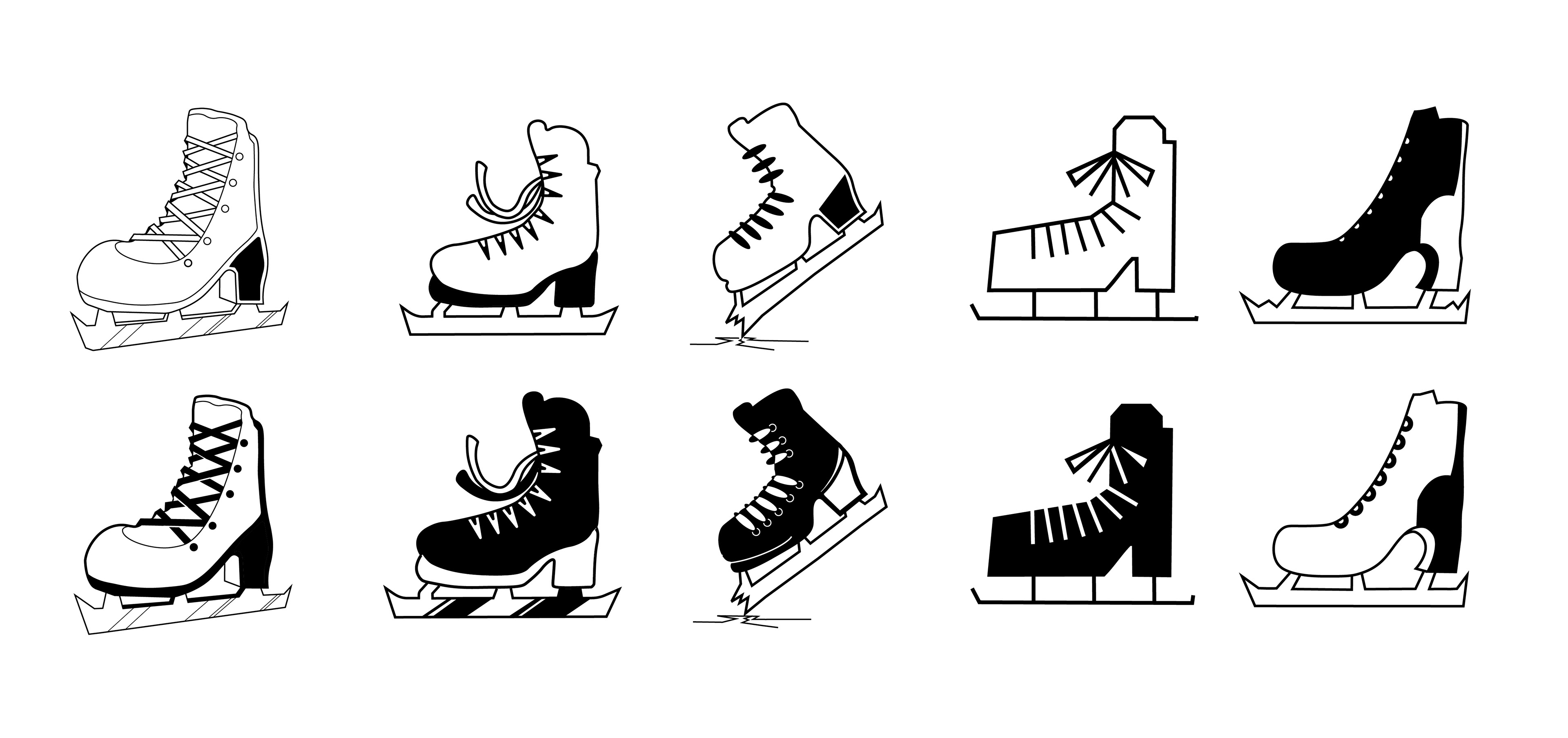
COLOR PALETTE EXPLORATION
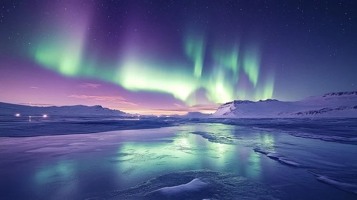
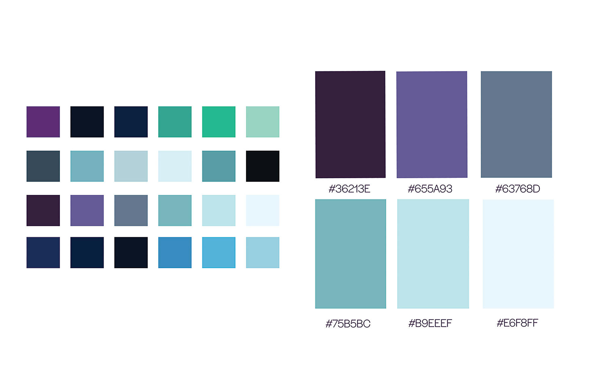
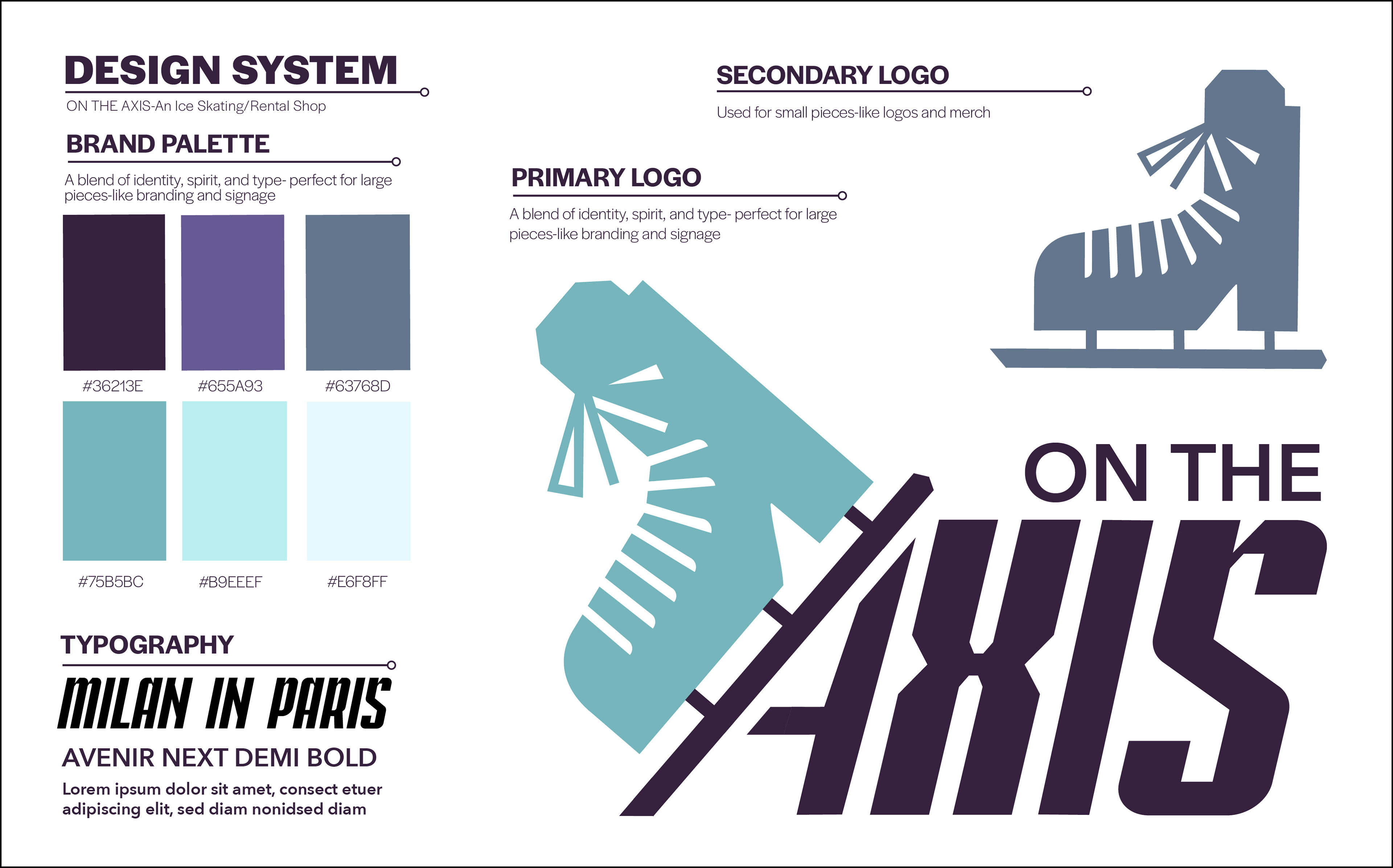
As I thought about my color palette, I was inspired by the colors of an aurora on a winter's night. I decided to incorporate a wide range of shades instead of limiting myself solely to "icy blue."

LOGO EXPLORATION
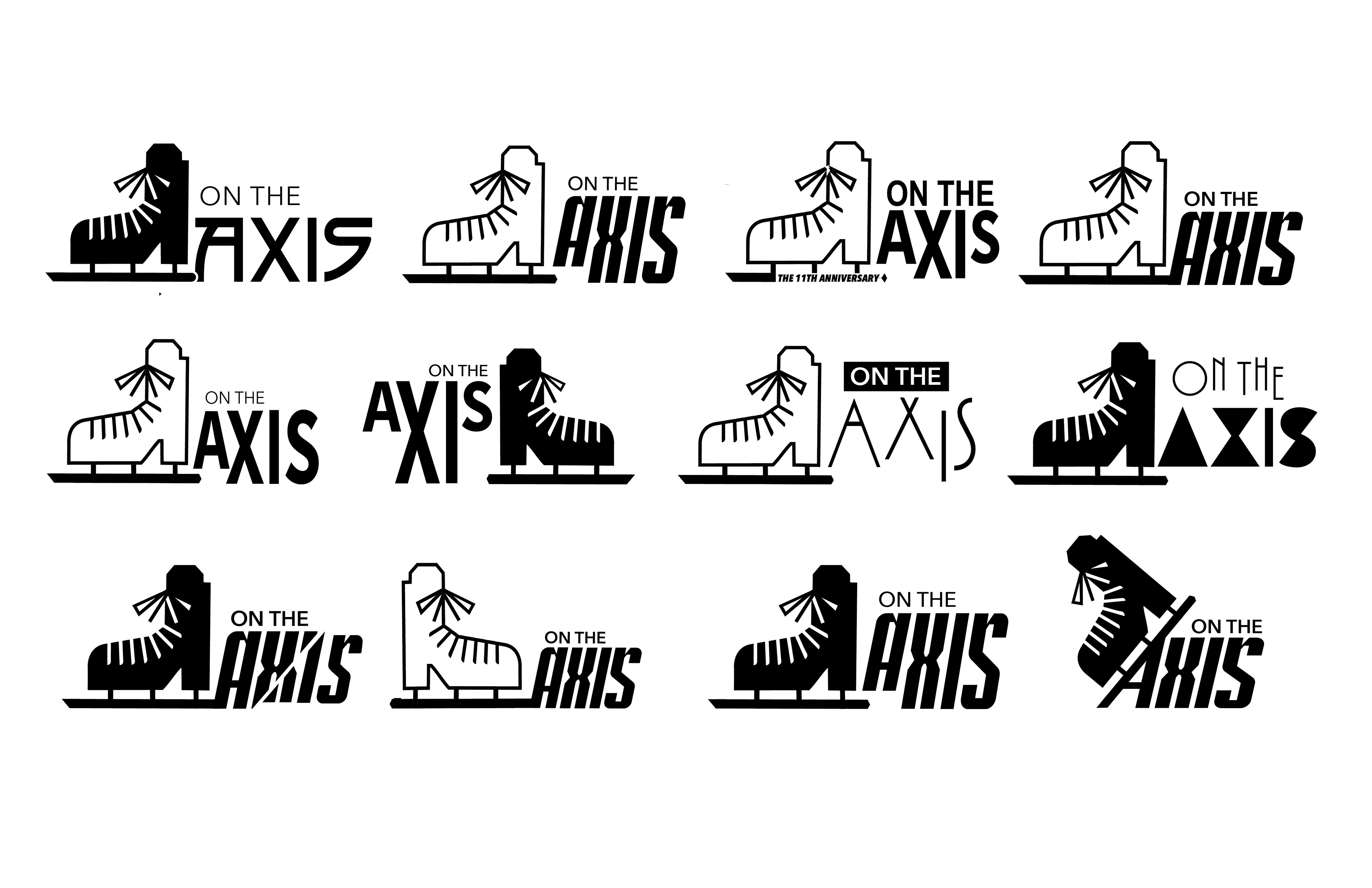
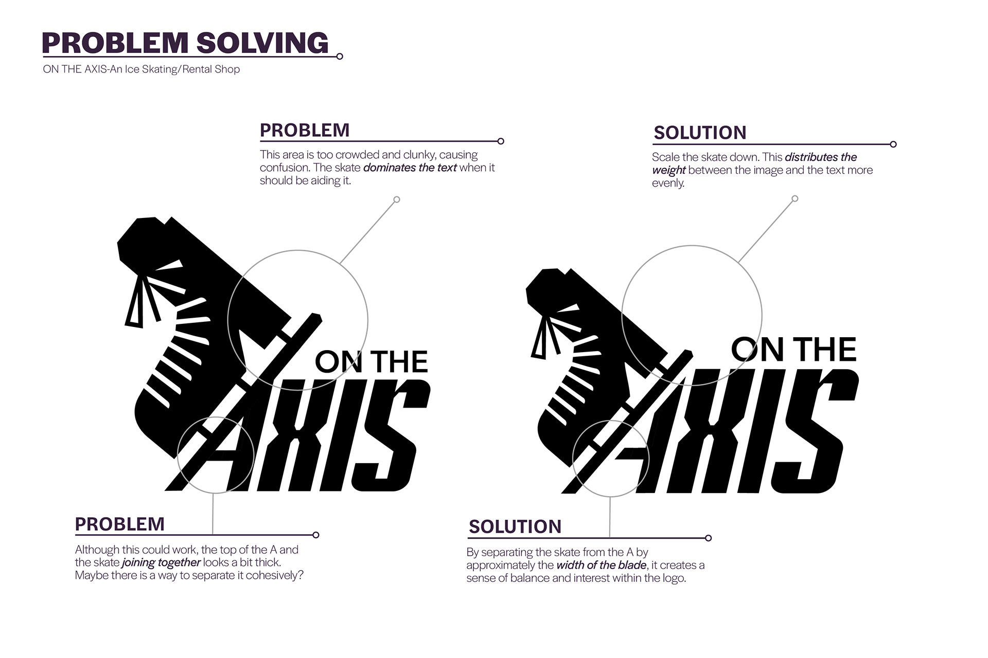
Next, I built out many different versions of my logo, experimenting with type, weight, size, color, and orientation.
FINAL BRAND GUIDELINE SHEET
PACKAGING DESIGN
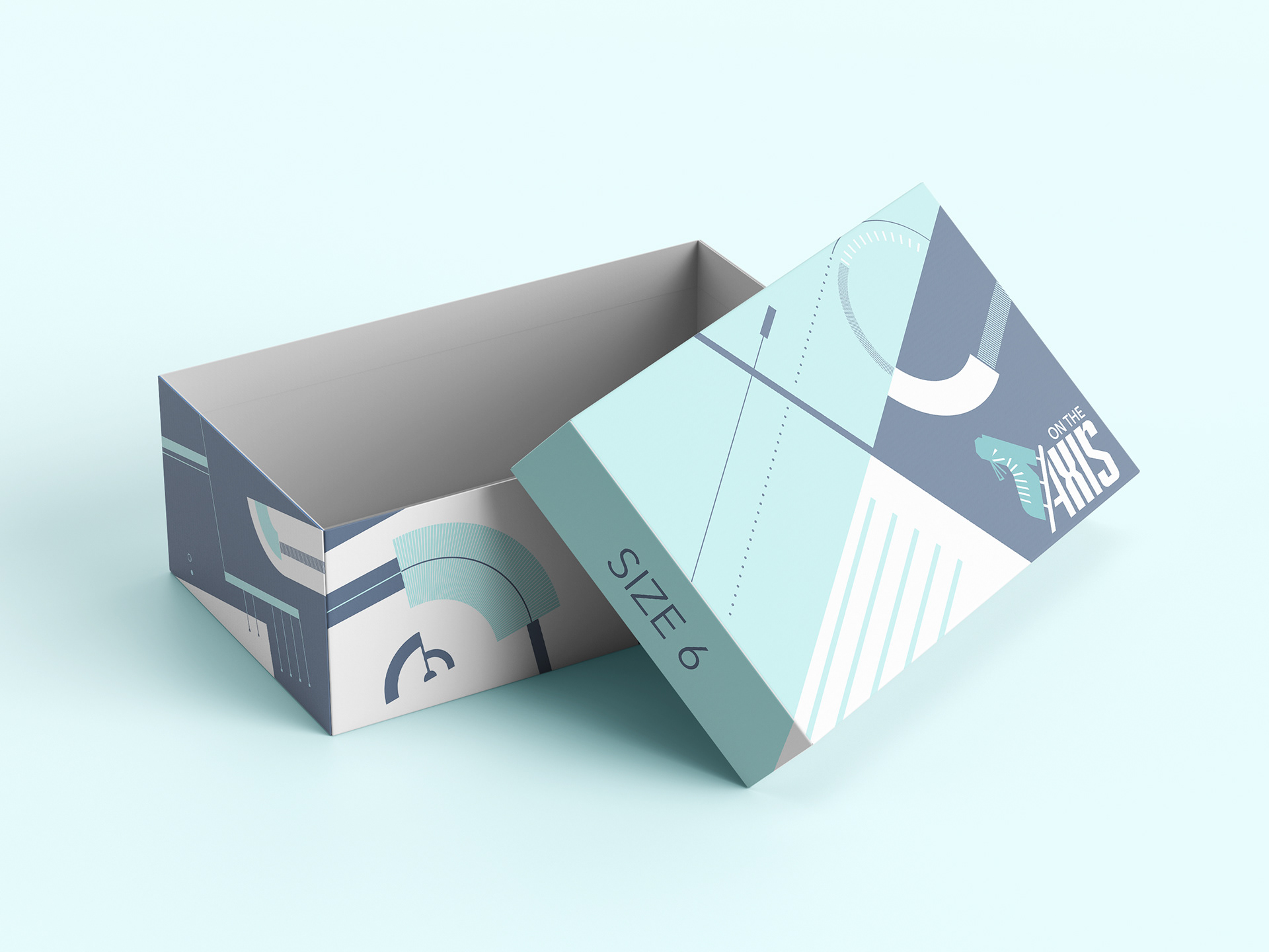
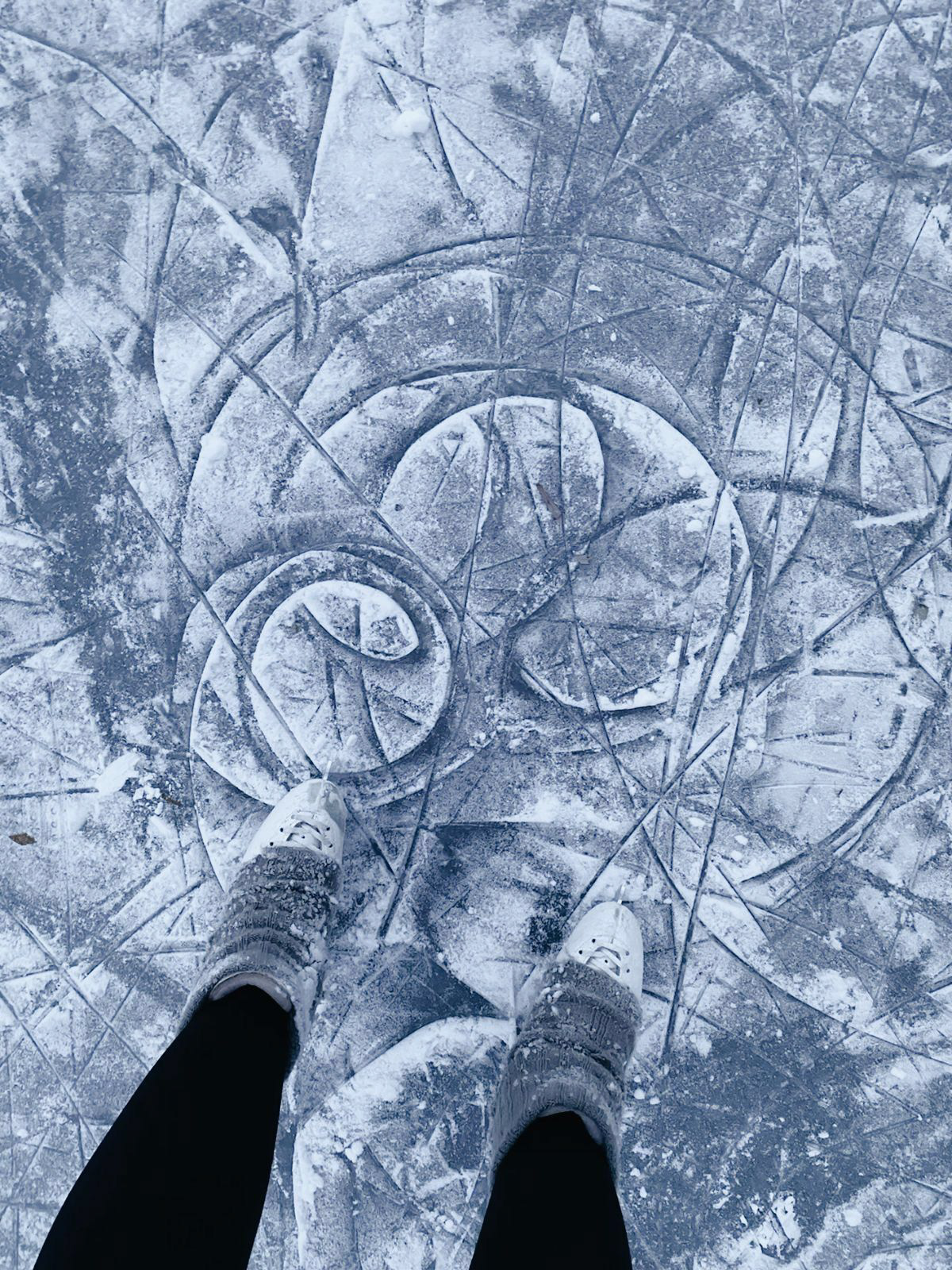
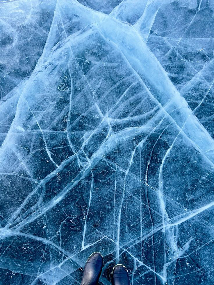
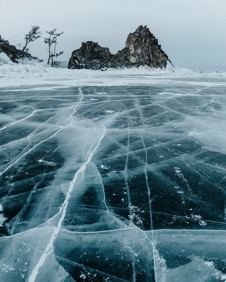
Although we were not required to create packaging for our design, I decided to repurpose my design aesthetics work to make a shoebox for my ice skates. I was inspired by the circular, icy patterns figure skaters leave when they skate.
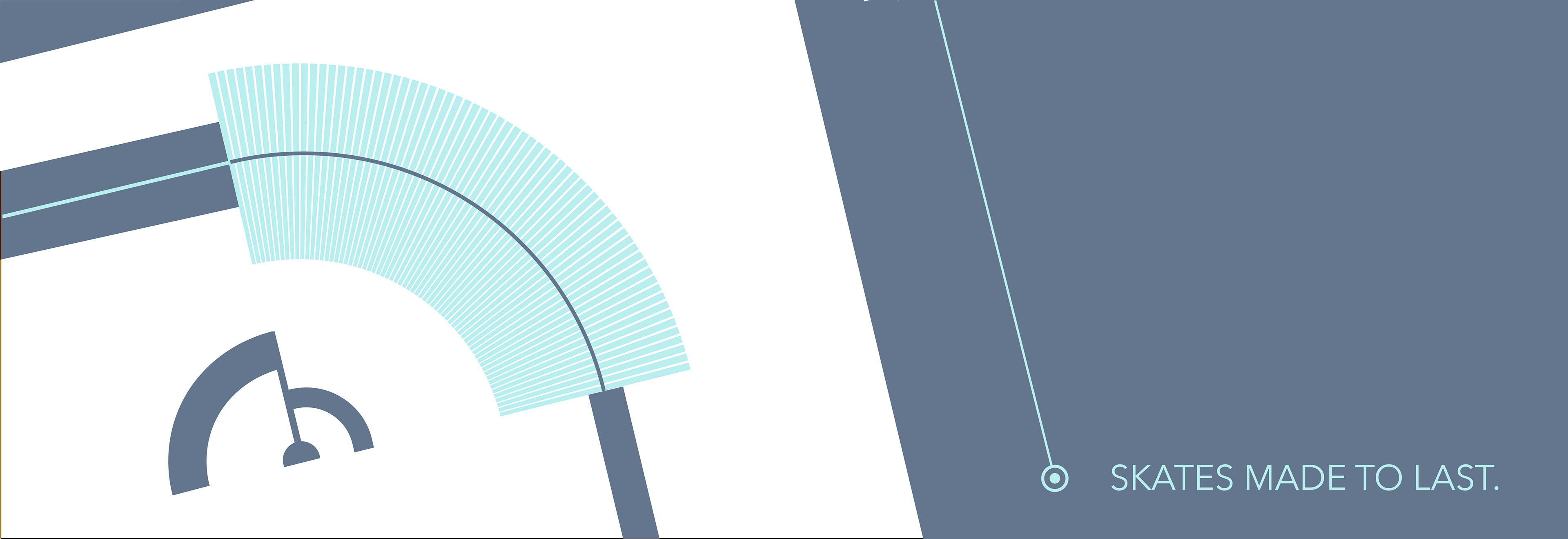

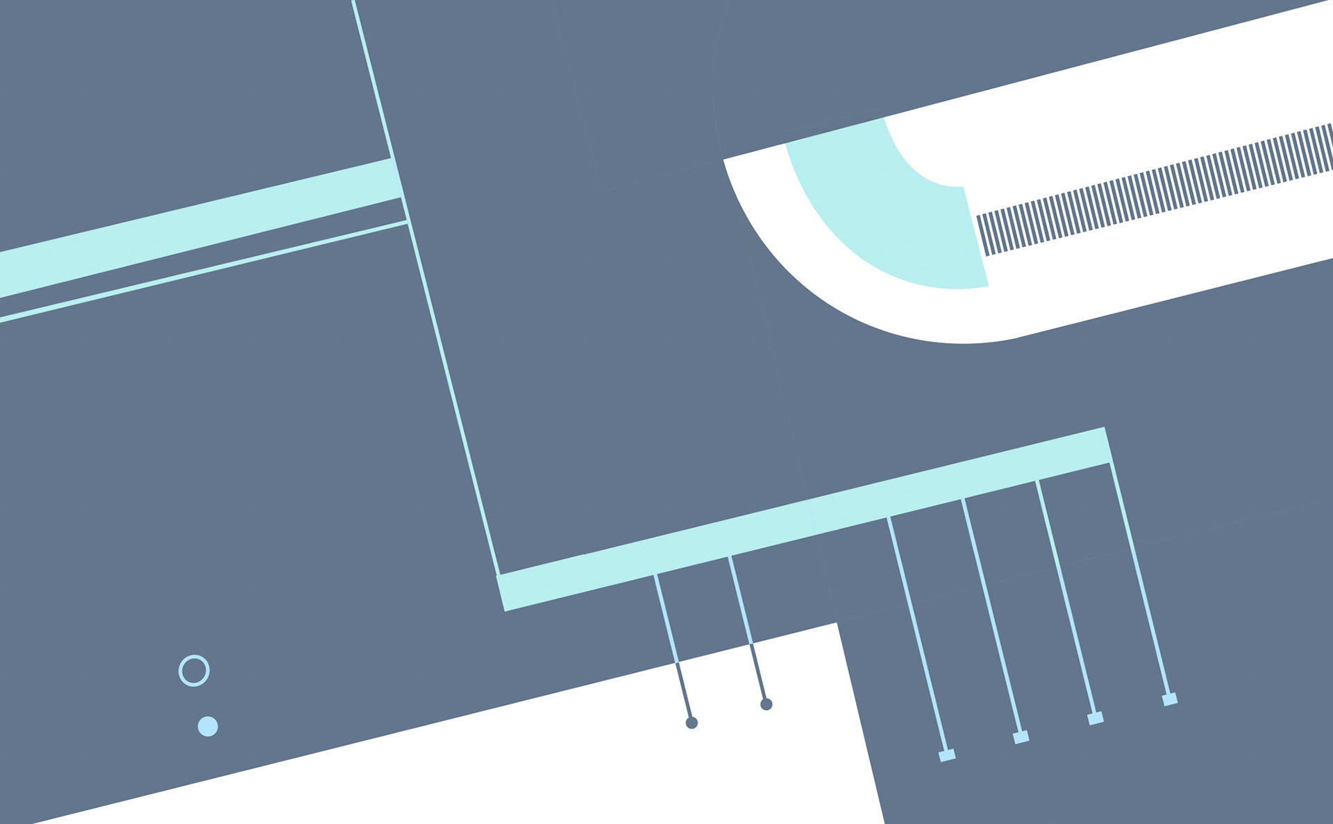
Shoebox